Friday, February 26, 2010

Assignment [Blog Illustrations]

ARGH I AM FALLING BEHIND HOW COULD THIS HAPPEN
But more on this later.


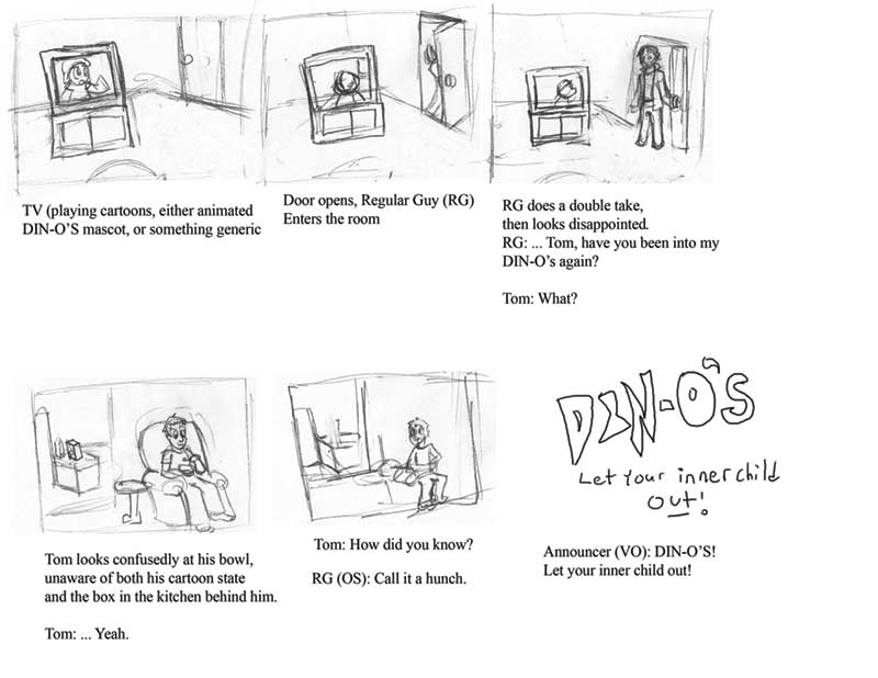
Ahem, yes, assignment. These are some spot illustrations for this blog, right here, and I would tell more but I am so tired I am falling asleep at the controls. So! Let's make this brief!

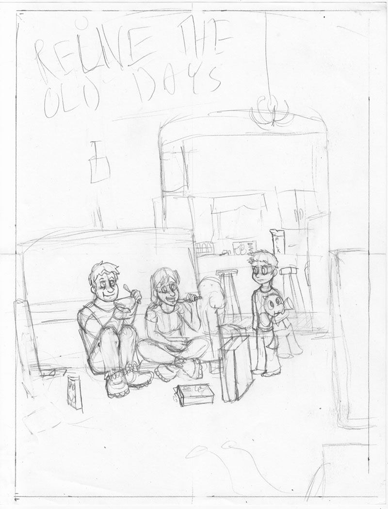
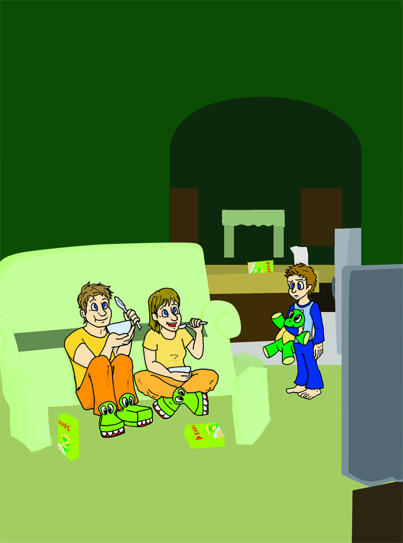
I don't have a proper header illustration yet - I have a sweet concept, but, er, it's not quite done yet and I don't trust my sense of judgment when I'm in this state of mind (sleeping). So for now, here are two spot images as placeholders:


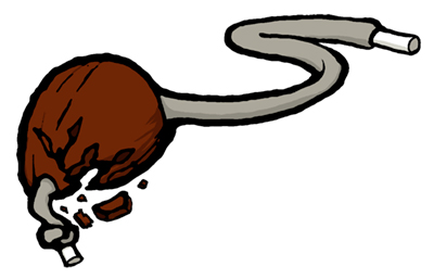
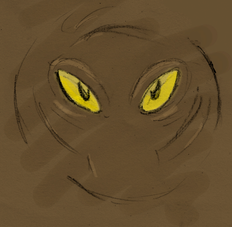
This is a chestnut, to be used just after this part: We all rode our bikes to find the source and ended up at the farm on which our chestnut tree stood. Terrible fire - barn burned down and a few animals were killed. Quite a spectacle for young kids. We stayed for hours and all got in trouble when we got home because our parents didn’t have a clue where we were.

Originally I was going to do some cutesy cartoony Reader's Digest-esque thing with kids playing this game, but then... I didn't, either I couldn't get the kids to look right, or I figured it was too complex for a little breaker image.

Soooo between that short story and its ending and stuff, I thought I'd draw the chestnut-on-a-string. Broken, to look more interesting, and because an intact nut would probably be in competition, not laying on some surface or another.

Also, its broken and discarded state would symbolize something deep or another in reference to the burnt-down farm, and then the eventual uprooting of the tree to make way for the campus. Like... the end of its era or something.
(Don't take what I'm writing too seriously right now, since it is like 2:30 and I have been sleeping terribly this past week so I am like REALLY tired you guys)

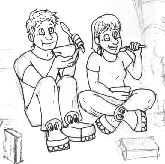
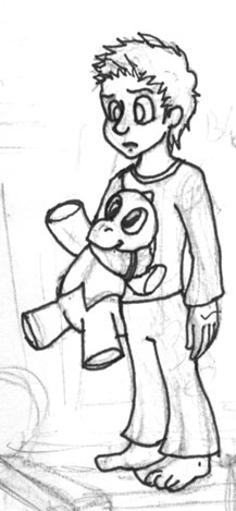
Er... as for my process, I drew it in pencil, inked it terribly, fixed it up a little in photoshop, and... coloured it. *thumbs up*

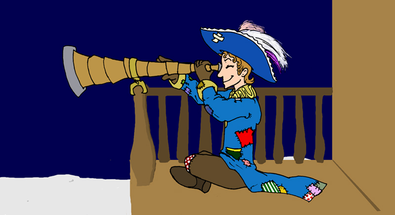
The same process more or less goes for this one:


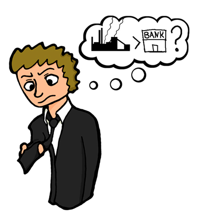
Which is an interpretation of Rick Court realizing that he is making less money as a banker than he did as a steelworker. Ah, those sweet summer jobs, right? *looks fondly back on that Riverboat kitchen... good times*

... Right, professionalism.

Alternate drawings for that thought bubble were a little $500 bill with wings, flying away, or $500 flying out the window, because I can do math and this is totally what was meant in that segment. Alternately, it was going to be a black tie, posed to mimic that chestnut earlier. With a $500 price tag, possibly. But... er, it wasn't working out, I think. I don't know, I just found this file coloured on my computer and the other one wasn't, so...

I SWEAR I will try to finish that other big illustration by sometime tomorrow! Really!

But for now I am actually typing with my eyes closed so I will return later with edits and wonderful drawings just you wait and see you guys
Goodnight everybody!

Wednesday, February 17, 2010

Assignment 2 [Storyboard: Thumbnails]

What are you talking about, this was here the entire time.


That's totally 30 seconds! It just looks short because there's not a lot of shot changes, since it's two guys talking to each other.

More on the excruciating task of coming up with this idea (and how it stumped some people) later! Or... not.

Thursday, February 11, 2010

[Illustration Friday] Round 3: Muddy

It's that time again! Illustration Friday time!

When I was younger, I had a fear of deep water. When we went canoeing on our yearly camping trips, I would nervously look over the edge to see how deep we were. I'm not sure what I thought was worse: clear water, that let me see straight down to the bottom of the lake, potentially revealing the creatures living amongst the weeds, or murky water, that hid whatever secrets it had.


Hahaha, yup, not quite as dramatic as my intro paragraph, but... When I heard Muddy, I thought something lurking in muddy water, because that's how I roll.

Actually, I kind of pictured dogs and cats covered with mud, or some manner of muddy pawprints, but eeehn, it's been done, and probably better.

I originally wanted to do this in watercolour, but I... don't have a lot of space on my desk at the moment and by the time I get home at the end of the day I'm really beat (That's my excuse and I'm sticking to it). And since I'm still transitioning to using my fancy computer programs to colour/draw stuff from never ever using them, I thought I might as well work it in.

I was going to try throwing a texture on, but I also realized that my scanner picked up the page's texture, so I just... cleverly kept that in.

Also, those pencil lines, are just... I wanted to go for kind of a sketchy look, I guess, for a poor-visibility sort of thing.

I think this is how it looked in my mind, overall, but... Something still feels wrong about it. I don't know! What do you guys think?

PS this is an alternate, without that sloppy brush-thing on it:


IN OTHER NEWS: Still can't comment on other people's blogs; either my anxiety problems uploaded themselves to blogspot, or there's some weird formatting problem. I changed my comment window style-thing on my own blog, and now I can comment on my posts, whereas the default settings apparently hate me. Man, this is embarrassing. HOW DO I USED BLOGSPOT?!

Aaaaaaand that's enough looking professional for one day.

Thursday, February 4, 2010

[Illustration Friday] Round 2: Focused

[Er, right, this post is for Illustration Friday! Though I think it's more likely that people are coming here from there instead of the other way around, but...
Also also, I seem to be having problems commenting! I swear it is because of some sort of dark sorcery and not a lack of knowledge on my part!]

I alternated between a little sequence of sketches, to kids measuring baking stuff, to a pirate sitting on a busted dingy on the moon, and cycled through them until I started drawing the kids and ended up with this guy:


I... Planned on more for this picture, but time and lack thereof totally got in the way (and not skill whatsoever) and I could not finish the awesome scene I had envisioned from the start. Man, I hate it when that happens!

So I haven't seen The Adventures of Baron Munchausen in like, forever, but it's one of my favourite movies, and one scene I remember clearly is when they fly a ship to the moon. They either just landed it, or they were actually sailing across the surface of the moon as if it were water. Whiiiich is what I tried to get across here, but... Er... haven't, quite.

In my original idea for this thing, I was going to have a bigger scene, where you see this patchwork guy's boat, which is also tiny, and also has patches on his boat and sail. And stars in the sky. Also his eyeglass/telescope was bigger! And shinier! And had neat little things written on it! And everything else would be shaded!

- Ahah, but that will be later, I promise (and really mean it this time, guys).

The, er, rest of the idea was that he was focusing on something in the distance, and despite the fact that basically everything he owns is patched up in some form or another, and his boat is tiny, and his hat doesn't really match his coat, he's still eagerly planning his next moon-pirate thing.

*thumbs up*

Wednesday, February 3, 2010

Assignment 1 [Magazine Ad]

Okay, next time I think 'hey, I can totally finish this in class!' I need to 1: Hit myself, and then 2: finish the bloody thing before school. :/

So. Uh. Yeah. I'm kind of awful at time management. I mean, really, not so good. And... that's all I'm going to say before I get too critical and depreciating on my own blog! Onwards!

The project was to do an ad for our children's cereal, targeted towards an older audience. We were told to draw what we know.

Me: Cool, let's see, what target audience am I? I like drawing, dinosaurs, cartoons, video games... wait... aw phoey.

SO the official excuse explanation for this is: It is for those who are still young at heart - those who are too old to eat cereal whilst watching cartoons yet do it anyway, those who wish to relieve those fine old days where all you had to worry about was getting up on time to watch your favourite Saturday morning shows.

I - er - my thumbnails/preliminary doodles are not scanned and also at home, so I will add them later. Which is too bad, because I went through a design change with the parents, and the kid looked more like a kid...

Oh, right, my concept.


What you see here is a kid watching in confusion as his parents eat all of his sugary breakfast cereal while watching cartoons in a lazily constructed couch fort. There may also be some old-school NES controllers on the floor. The stuffed animal the boy holds is the mascot of my cereal brand (without his explorer helmet, since that was too large and hard to slip into the drawing). The parents joyfully eating cereal while watching TV are supposed to get across the ad thing. Yup.

So next I did a colour comp. Initially, I tried working with markers, and essentially wasted an entire class trying to draw something close to final lines, before giving up and spending like an hour roughly colouring it in at home. Good work, me!


So here I'm trying to go for some colour theory-ing, where I use only yellow, green, and blue. I also am trying to use yellow to - ugh - represent the parent's happiness and youthfulness, and more importantly, draw attention to the fact that they are eating cereal and being happy et cetera through the use of that brighter yellow colour. The kid is in blue, to show how sad he is without cereal, and, more importantly, to make him stand out, while making him a little less noticeable than the parents. He's there to direct attention to the parents, if they fail to catch reader attention first.

For the final process, I decided I like the first sketch of the boy that I did (that I also did not scan), while I liked my second shot at the parents (which you can see in the two pictures above). Sooo... I inked and scanned them separately.


Every time I draw that poor kid, I swear he gets older. The first time I sketched him, he at least looked under ten, then when I drew my second rough sketch, he looked kind of twelve, and now... I don't know, but hopefully he's young enough for the ad to work.

Anyway, yes, so, scanned them, and with a little assistance from the teacher (because I am a winner and I decided to do this digitally when I have next to no experience doing things digitally go me I live in a cave!), got ... things working, I suppose.

And, uh, tadah!


So... Stuff happened, I thought I could do background and furniture digitally and have it look right. Only... It didn't look right, shading them fancy-like took away from the cartoony look of the ad. Or... stood out badly with the cartoony style of the ad. Which... I was hoping to use to keep up with the 'eating cereal, watching saturday morning cartoon' thing.
So that ended with me spending most of a class I intended for shading/other stuff, redrawing what I already had because it was looking terrible, trust me on this.

The background wall is way too bright, I should have made that duller; the colours I used to shade were too subtle or similar to the base colour; the kitchen background is a little bare and could use more things, and also softer edges so as to not draw the eye too much from the foreground - I could actually go on for another hour writing about the things wrong with this, so, let's just say I think it could be improved. Unfortunately, today is due-day, and this is what I have. *cough*


Overall, this was a fun learning experience in what NOT to do when drawing backgrounds or colouring projects! ... And, okay, some things I could try that would have been swell if I thought of them last week. Ah, well, we're here to learn, right?

... So, yes! That's all for now! Tune in next week- next day! Tomorrow! Tune in tomorrow when I post my horribly rushed Illustration Friday art! *thumbs up*