
So. Uh. Yeah. I'm kind of awful at time management. I mean, really, not so good. And... that's all I'm going to say before I get too critical and depreciating on my own blog! Onwards!
The project was to do an ad for our children's cereal, targeted towards an older audience. We were told to draw what we know.
Me: Cool, let's see, what target audience am I? I like drawing, dinosaurs, cartoons, video games... wait... aw phoey.
SO the official
I - er - my thumbnails/preliminary doodles are not scanned and also at home, so I will add them later. Which is too bad, because I went through a design change with the parents, and the kid looked more like a kid...
Oh, right, my concept.
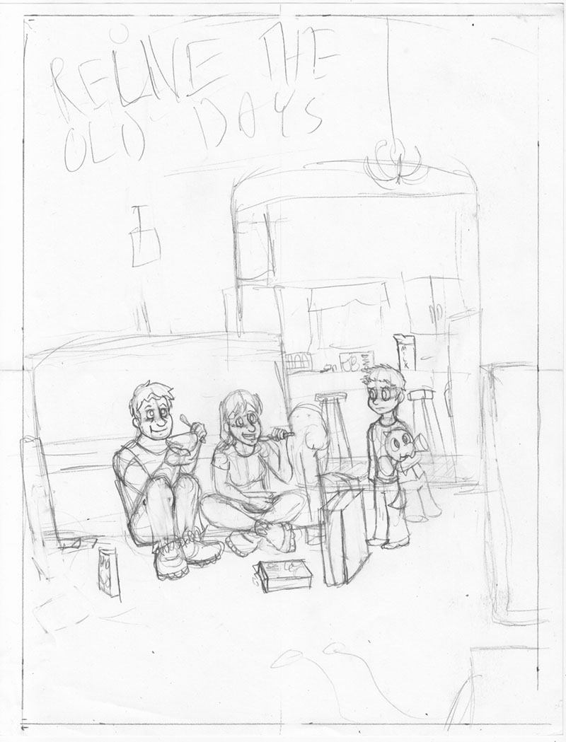
What you see here is a kid watching in confusion as his parents eat all of his sugary breakfast cereal while watching cartoons in a lazily constructed couch fort. There may also be some old-school NES controllers on the floor. The stuffed animal the boy holds is the mascot of my cereal brand (without his explorer helmet, since that was too large and hard to slip into the drawing). The parents joyfully eating cereal while watching TV are supposed to get across the ad thing. Yup.
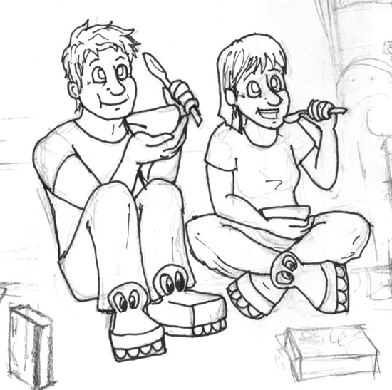
So next I did a colour comp. Initially, I tried working with markers, and essentially wasted an entire class trying to draw something close to final lines, before giving up and spending like an hour roughly colouring it in at home. Good work, me!

So here I'm trying to go for some colour theory-ing, where I use only yellow, green, and blue. I also am trying to use yellow to - ugh - represent the parent's happiness and youthfulness, and more importantly, draw attention to the fact that they are eating cereal and being happy et cetera through the use of that brighter yellow colour. The kid is in blue, to show how sad he is without cereal, and, more importantly, to make him stand out, while making him a little less noticeable than the parents. He's there to direct attention to the parents, if they fail to catch reader attention first.
For the final process, I decided I like the first sketch of the boy that I did (that I also did not scan), while I liked my second shot at the parents (which you can see in the two pictures above). Sooo... I inked and scanned them separately.
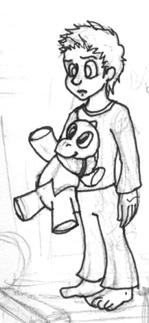
Every time I draw that poor kid, I swear he gets older. The first time I sketched him, he at least looked under ten, then when I drew my second rough sketch, he looked kind of twelve, and now... I don't know, but hopefully he's young enough for the ad to work.
Anyway, yes, so, scanned them, and with a little assistance from the teacher (because I am a winner and I decided to do this digitally when I have next to no experience doing things digitally go me I live in a cave!), got ... things working, I suppose.
And, uh, tadah!
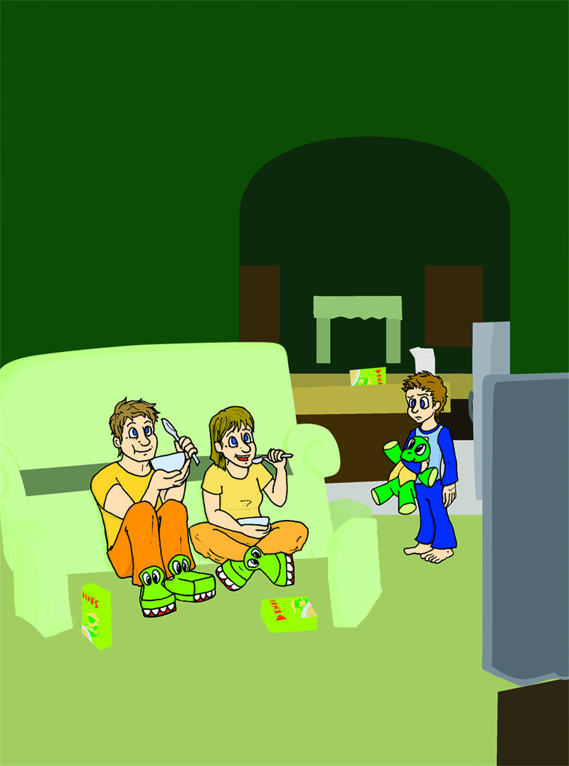
So... Stuff happened, I thought I could do background and furniture digitally and have it look right. Only... It didn't look right, shading them fancy-like took away from the cartoony look of the ad. Or... stood out badly with the cartoony style of the ad. Which... I was hoping to use to keep up with the 'eating cereal, watching saturday morning cartoon' thing.
So that ended with me spending most of a class I intended for shading/other stuff, redrawing what I already had because it was looking terrible, trust me on this.
The background wall is way too bright, I should have made that duller; the colours I used to shade were too subtle or similar to the base colour; the kitchen background is a little bare and could use more things, and also softer edges so as to not draw the eye too much from the foreground - I could actually go on for another hour writing about the things wrong with this, so, let's just say I think it could be improved. Unfortunately, today is due-day, and this is what I have. *cough*
Overall, this was a fun learning experience in what NOT to do when drawing backgrounds or colouring projects! ... And, okay, some things I could try that would have been swell if I thought of them last week. Ah, well, we're here to learn, right?
... So, yes! That's all for now! Tune in next week- next day! Tomorrow! Tune in tomorrow when I post my horribly rushed Illustration Friday art! *thumbs up*


That's really great Ariel! I really like the expression on the boys face.
ReplyDeleteHey great work! I love how innocent and childlike your ad is. It's so fun! I love it!
ReplyDeleteHey Ariel; You're so funny. I love reading your writing... it ads so much to your posts. Great job :^)
ReplyDeleteI think your ad had a very strong concept and you came a long way with the art. You've got a nice style that you just need to keep working on. Over all, a great first effort! Keep going!
Uh, I meant "adds" ;^)
ReplyDeleteGeneral: Thanks, guys! :D I'm glad the expressions and theme got across. ^_^
ReplyDeleteLeif: I'm glad my writing is entertaining, ahah. (also after writing this post I was swapping 'ad' and 'add' the rest of the day, man oh man)