Friday, April 23, 2010

Assignment: Promotional Postcard

Man I am SO happy with this concept, especially when it took me forever to get to it.

You see, dear readers, we were supposed to come up with a card to promote ourselves. A postcard.

My problem was that anything that featured my regular characters had some dialogue and that got cluttered, anything with me personally was a little self depreciating, and any combination of the two was a clunky disasters. There was also some things trying to advertise me as some kind of character-creating machine but I really wasn't happy with the look and feel of those too.

Defeated, I turned to my doodle page and started brainstorming again. Back to the drawing board, you might say. I then told myself that I'd try to come up with something using the next thing I sketched, with the theme of 'AWESOME', since I could advertise some percieved trait of myself or something.

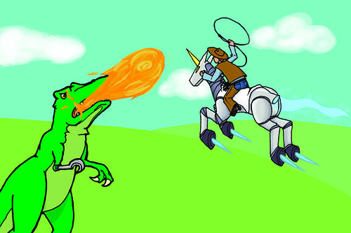
I started drawing... A cowboy. Riding a unicorn. No! Riding a... A ROCKET UNICORN! ROBOCORN!

But what would be awesome enough for them to f- T.REX!

And thus, this drawing. From there, I just let go and got as reasonably ridiculous as I could, escalating my idea of 'awesome' within the drawing - make the T.Rex breathe fire, make the exhaust magic - at one point, one of my sketches of the T.Rex had a wonky right arm; I got frustrated and gave it a hook. Just about everyone I showed it too afterwards demanded that I keep it in, so I did. Pretty cool, huh?

Oh, wait! The art, that's right!


Dinosaur-wrangling got a lot harder when they taught themselves to breathe fire...


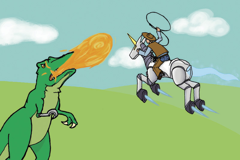
At some point, there was going to be a field of, like, Triceratops or Stegosaurs in the fields behind them, but, er, it was... looking cluttered, yeah. I'll try to make it work, though, but... perhaps not when I have a deadline.

Details! The lasso is coming out of a spool-like-thing on the Unicorn's saddle-part - which is actually its middle, since it's a robot, it's built right in. The T.Rex's lines are a little thicker... but its eye is shiny? Also check out those clouds!

So, yeah, I also have to say that I might have been partially inspired by the likes of Dr. McNinja and Axe Cop. And this game from Cartoon Network that I can't link to you right now, but I'll edit it in later. And here we are!

(PS, you should totally read those comics I linked, seriously they are awesome. One is about a ninja who is also a doctor, the other is drawn by a 29-year-old artist, and written by his 5-year-old brother. That is all you need to know.)

OH, in terms of advertising myself also, after using the front to generate confusion and curiosity (confuriosity?), the reader will check the back and see text along the lines of 'You, too, may have this much awesome in your employ!' or 'You, too, can have this much awesome at your commmand!' something like that to advertise myself and my crazy brain. Sounds good, right?

-dusts hands, looks at posts- Huh, nice, all that work and it's not even noon! Good work, me!

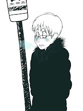
PPS, kids, this is what happens when you try uploading a CMYK file to the internets:
NOOOO MY COLOURS

Groovy.

[Illustration Friday] Round 12: Linked

Alright, I'm nearing the end of this postingpalooza (unless I find more neat stuff to show you before time runs out), So here's another hand-drawn thing showing off something we all probably have experienced before:


There's always ONE.


Ah, HTML. I could be happily coding a table or a post, but miss ONE LETTER and the whole thing goes to heck. Incredibly frustrating, especially if it's like, a lengthy bit of story you wrote in a comment and now it is uneditable because you posted it but the code is wrong and you can see where you made the mistake and it's right there but you can't fix it--

Right, right, so, I liken this to those Christmas lights, y'know, where one bulb would go bad and then the rest of them don't work? I've never seen that personally (probably because mom and dad are like ninjas when it comes to getting out decorations; I could be in my room for an hour and then I'll leave and find the Christmas tree assembled and ready), but I have a feeling that searching through coils and coils of lights is like searching through lines and lines of text when it comes to this sort of thing. Assuming you only made one mistake, too.

Pen and ink again, with marker as the outgoing link in my hands there. I think my hand slipped on the jaw, but I kind of like it like that. Glasses are small so the eyes aren't completely blocked out by the frames, I hate it when that happens, and that's the only reason I still occasionally 'forget' to draw my glasses. God, my drama teacher was right about that, I never thought I'd agree...

Next post is going to be AWESOME.

[Illustration Friday] Round 10: Rescue

HERE WE GO AGAIN WOOOOO--

-checks drawing for this prompt-

--ooo, right.

I was a little... Melancholy, shall we say, when this prompt ran, and most of my concepts ended up here:


How can you tell if someone needs rescuing?


Well something like that, to the effect of not all damsels and dudes in distress really show it. Because I was feeling really self-pitying that weekend (as usual, I put the blame solely on sleep deprivation, and nothing else *nod*).
I'm not sure if it came out quite as clearly here, though. That's supposed to be, like, that writing you do when you breathe on a window? Like that, so it's hidden unless you know where to look/breathe.

I did this entirely in pencil, with the words done by etching them in with a dead pen (and now the page beneath it has cool secret writing too!), and then going over it lightly in pencil, and then blurring that pencil with an eraser. Done and done.

I probably should have darkened the space behind the dude, though, but eh, next time.

I seem to swing between childish-ridiculous and whiny-depressed. Curious!

[Illustration Friday] Round 7: Brave (missed)

SO YEAH I really actually like this one and I wished I finished on time (partially because I had that texture technique fresh on my mind at the time, and now I forgot it).

For this one, I thought about brave things. Knights are brave. Lions are used to represent bravery. When you're little, you try to be brave and sometimes wanted to be a knight... Well okay maybe that's just me (and my steed was totally a dragon, not some silly little lion), but still!

With the childish thing in mind (and because I like doing simplistic drawings sometimes - feels like taking a break, y'know), I went forward with this! ... Several weeks after it was due!

... I should probably stop going on about doing things late. >__> Well, I mean, I had like five other things to do at the time but--

RIGHT. CUTE ART.


So I did this little number up in Illustrator, but I forgot how to properly, like, put textures on individual pieces because I'm a pro. I will bet you actual money that I remember how when I get home tonight (in which case I'll redo this and add it to the pile of 'remixed art' I'll release some time). I should probably not talk about me forgetting things too.

Ahem, right, I still wanted to throw down the papery texture, though, so it felt like a children's drawing or something out of a kid's storybook. ... In this case, a well-worn storybook. Because... it's real popular, yeah, that's right...

Honestly, there was a period there where I was afraid I was going to really hat that knight when I was done with him but he turned out surprisingly well! I did some neat little multiply-transparency-gradient to make the armour shiny, and gradients for the little visor-slots and the shading on his feather.

The lion, I had a decorative brush, I think? I had one of those outline a circle, that's how I got the mane down. It worked better than I had hoped!

So yeah I really like this. PS, here's a version without the texture so you can see it in its original eyeblinding glory:


Yup! That's all for this post.

... Y'know, I should draw cutesy things in Illustrator more often...

[Illustration Friday] Round 4: Adrift (missed)

So, yes, this is one of my old Illustration Fridays that I missed and thought 'oh well, I'll finish it later and it'll look awesome'. Yes, well, apparently, I need these Illustration Friday submissions for, like, marks. WHOOPS.

SO, here is Adrift:


Oh no! A rare sky-jelly has been knocked astray from his cluster! Poor little guy!


*ahem* There's a bit of an embarrassing story behind this, as I was all set to use a nighttime city background to make it look like he's drifting high above the earth, but not having any on hand, I hit flickr. I realized that this was one of those things I'd need permission form, but I am way too shy, so I asked 'is it okay to just use this if I link back?'

It was one of those moments where you realize you're saying something really, really stupid the moment you open your mouth, and you can't stop yourself - you can only listen to yourself ask that dumb question in glorious slow motion. I'd like to say I was tired or desperate or something at the time, but ehn, no excuse. God, I felt dumb that day.

Yeah, no, you can't just use stuff and credit without asking. This isn't DeviantArt, after all.

SO YES, don't worry, with all the extra time I got after missing the Illustration Friday deadline, I had time to scrounge through some old pictures of ours and found a blurry .JPG of Toronto at night that we took from a hotel one of the years we were at Anime North. Good times!

Actually, with a little tweaking, it worked. It kind of looks like a city street or something, right? I mean, technically it is, but it looks like it's from real high up right?

... Yup, and thus begins post one of the post-a-thon today. (Why yes, today is my last day of class, how could you tell?)

Friday, April 9, 2010

Illustration Friday [Round 11: Dip]

As usual, after sitting and ho-humming (I think that's a verb now) over some design or another representing my deep insecurities, two ideas collided in my mind as I tried to figure out a better interpretation of the 'dip' prompt on Illustration Friday. Then I started going through definitions, and somehow, these all connected in my mind:

1) The Super Dictionary, from DC comics. I wish I could tell you more, I wish I even knew where to start linking, but the best I can do is link you to a Google image search like a pro and pretend I accomplished something.
For the link-phobic, essentially it is a dictionary for children with definitions illustrated through various DC superheroes. Needless to say, er, more than a few of these definitions seemed a little oddly placed, scenario-wise, or downright confusing, but overall, hilarious (Forty cakes, anybody?).

2) The Dip, from Who Framed Roger Rabbit. You know the one. Paint-thinner, designed to kill your favourite cartoon characters.

... Okay a little melodramatic, but you get the idea. But how could I use the dip for illustration Friday?

This somehow ended up with idea three. Remember that bit of original art I posted a few weeks ago?

Well, she's technically a superhero... and in her story which I haven't elaborated on before this moment includes something like a cartoon character come to life, so...


Well that certainly illustrates the diversity of the word


And... yes. I am awesome and apparently picked a colour theme for my characters that does not translate well to the web at all! Woe is I. I... Will fix this somehow later. In the meantime!

Yes, the one on the left is supposed to look like a ridiculous anime-character. See, in-story, she is... Well, she's a thing that based her form on someone's childhood imaginary friend. The girl on the right, actually. Also known as the Animator. She controls ink. Together, they fight crime! Kind of. Fascinating story, really.

And yeah this is typically how they interact on-screen, at least in non-plot-significant situations; with Ari the anime-thing making hilarious off-the-wall comments and pop-culture references, and Annie over there trying to hang lampshades and criticize the typical stunts and situations of the superhero genre. Genius!

Though I will admit, I usually don't go as overboard with Ari's hair. I was just having so much fun drawing this though, I didn't want to fix it. Honestly!

... Though something's bugging me about the word balloons, but I guess I'll just have to agonize over that until I am awake enough to make good decisions again.

So, yes, because the dialogue looks a little cluttery to me after staring at this project for a few hours, here is a smaller version sans text:


Tadah!

Which reminds me, I swapped out my header for one with Ari in it, since she's in this week's IF post and all, but I'll switch back to the dragon-guy, or maybe someone else. See, I originally intended to have a rotating header bar, but, uh, ehe, I only had one header to use at the time. Now I have two!

And yes, I'm sure you'd love to read more of my lovely and eloquent writing, but I am very tired right now so I am going to bed. Thank you for reading and stuff, the usual!

Thursday, April 1, 2010

Assignment [Ride for Cancer Research Postcard]

Yup! The idea here was to draw something nice and post-card-sized to hand out to people for donating to the Ride for Cancer event, and make it something that someone would want to post up.

For about a week I was waffling on using some terrifying huge-eyed cutesy character congratulating someone for making a donation, but then as I was reading something with my brother, we somehow got to talking about this achewood strip, and I was struck by a brilliant new idea.

At least I think it was the achewood strip. I'm not sure now, but if I were to put money down, I'd say that's where it came from.

ANYWAY

The idea behind this postcard is a bicyclist making a ridiculous jump across a huge canyon, an 'awesome' move, much like the recipient of this card donating money to a good cause.


I drew this entirely digitally, so no rough sketches, though I did muck around with the text placement. Originally, it was on the lower end of the card, but after leaving it for a few hours, I reopened the file and realized that the text was covering up and filling up the nice little canyon I drew, and decided that the sky was less important than the depth of the canyon. Soooo I moved the text.

The original:


And because I like it so much, the card without the text:


I think the canyon's edge might be a little sharp in places still, but I was having a heck of a time trying to get those corners blunt and still looking good. Eeehn. I kind of still like it like this, though, so there.

Assignment 2 [Storyboard: Trace]

... Yup. We'll just... pretend... this happened a month ago.


My younger brother was the model for this shoot, though I took some liberties with his hair (it's brown now), height (a little taller), and clothing (wearing a coat; not in track pants, clothing colours). I wish I didn't have to make him take off his awesome glasses, but alas.

So that's enough embarrassing my brother on the internet. I kind of blanked out on the background. But... For practice (not for anything I'd ever post seriously, though), I should trace some photos of mine sometime - just doing this helped me figure out the clothing fold thing a little better. And also the legs I've been sketching have been looking a little out of whack lately...

But enough trying to distract from this!