Showing posts with label assignment. Show all posts

Tuesday, May 4, 2010

Montage Assignment - City of the Lost

So we were given an assignment in another class to do a montage-image based on song lyrics, scripts, a book, or our own creative writing. Guess which subject I picked.


Alright, so I could probably write a novel about each of the little thumbnails here (and in one case I kind of already have!), but I will be short and quick about it:

Top left, Nero and Yuu, those demons from my other post. Below those three, is a layout for a zombie story I was/am writing. Beside the zombies is one for a small sci-fi-ish idea I had involving a guy on the run from police robots. I'll make a post about them later. And finally above that one are some ideas that eventually turned into the one I went with. (If you tilt your head to the left a bit, you'll see it at about the top center of the page)

So I fleshed out that one a little more.
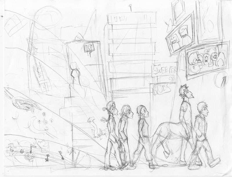


So these are characters from a comic I want to do one day (after I get through Superfailure and more of Carol in the Woods). From left to right, we have Mechael the clockwork robot; Thane, the teen who can slowly kill things by touching them; Sarah, the scientist with some kind of parasitic/symbiotic vine-thing in her veins; Aaron the centaur, and Steve the human. Behind the first four there are little streams that contain bits from their backstory, while Steve doesn't get any.
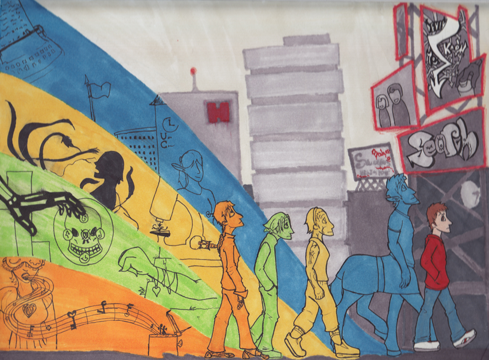


Tadah, here's the final thing. It's a bit blurry because the board it was mounted on was a little too big for my scanner. Also I was scanning this at not-four-a.m., and therefore kind of... uh...

SO the basic premise is that five people from different worlds wake up in a weird, empty city one day and then try to figure out why they're there. In between epic, mind-screwy breakthroughs, they just hang out.

So yeah, I have colour schemes for these characters picked out, which you can see here. I don't want to go into too much detail because part of me is convinced that this will spoil the plot before it's even finished, but, eh... Well, Mechael's is about his 'sister' and the fact that he's a wind-up-robot, Thane's relates to some traveling party of magic-users he was a part of and a girl he likes, Sarah's is about her 'acquiring' the sybiote, and Aaron's about him being in university because he is basically a normal guy, just with half-a-horse as his legs. Steve doesn't get one partly because he, too, is a normal dude, but also because he's a city-kid, and to adapt to the situation he starts identifying himself with the city. Or something like that. His colour theme is red, make of that what you will. Also!

So yes, other elements in this story is someone who drops cryptic hints via graffiti, two creepy newscasters, the apartment they live in, and the creepy hospital. And monsters called Sweepers, you can see a warning about them on a billboard in the background. Also! I tried to make the city background transition into the backstory-backgrounds, and sort of line up with elements there. It... kind of worked.

Speaking of, I intended for the buildings to be blurry! Since the city is ~mysterious~ and all, you see.

For the sky to be streaky... not so much. To be honest, I had to do a lot of this in a short time, which is a shame. On that note, the ink is supposed to be smudged in Thane's bar there. I did that by accident, realized it went cool, and then went with it.

Like many things I draw, I will go back and make this pretty in photoshop, and unlike many things I draw, I really mean it with this one.

Monday, May 3, 2010

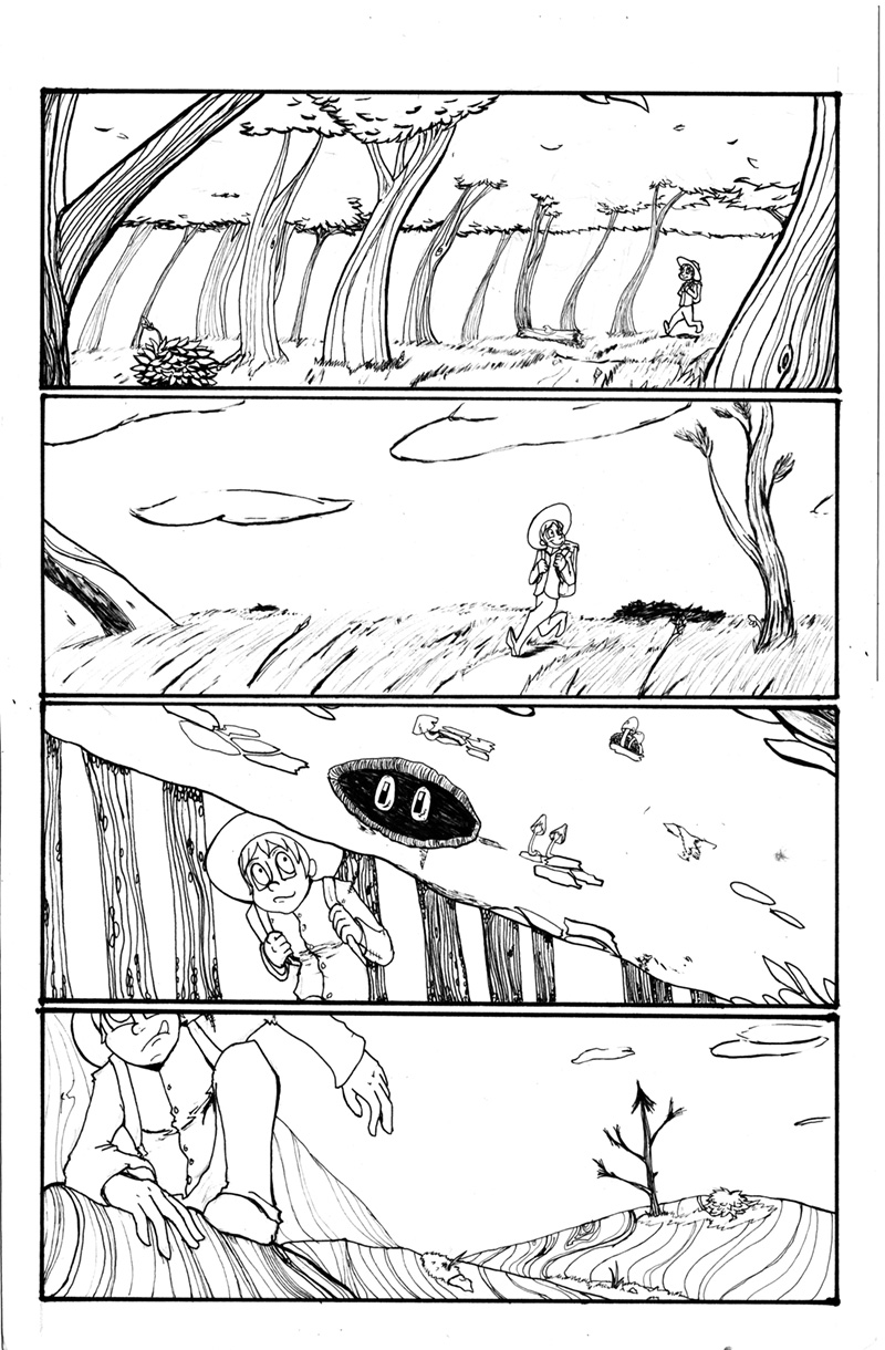
Final Assignment [3 page comic, Carol in the Woods]

So in a long story I documented on my project blog, for my final project I did three pages of comic. It was about a crazy person dressed vaguely like a Mountie walking through the Canadian wilderness, and I called it 'Carol in the Woods'. You can read the whole thing over here, but for fancy Art-Blog purposes, I'm posting the first page and my personal favourite of the three:


A close second was the last page, because of my playing around with perspective and frame arrangement, but this page I ended up spending more time on. Even if that log on the third frame is a little unfinished. I'm thinking of doing a version of these pages coloured, and a version of these pages just black and white inked. I'll let you know when that's finished.

About the page itself (and I promise I won't write a novel; I already did that in the project blog), I was playing around with the panel flow, sort of, making it look like Carol was walking uninterrupted, while traveling great distances, that sort of thing. I also wanted to show off a variety of scenery, too. And finally, I wanted to hint that she was a little unhinged, through including little things that are 'off' about the scenery, like eyes where they shouldn't be. Er, though the 'story' is more about Carol going places and seeing stuff than any deep analysis of an unstable mind.

Yup, I think that's about it. I've gotta go do some more art and stuff to mass post by tomorrow, cheerio!

Friday, April 23, 2010

Assignment: Promotional Postcard

Man I am SO happy with this concept, especially when it took me forever to get to it.

You see, dear readers, we were supposed to come up with a card to promote ourselves. A postcard.

My problem was that anything that featured my regular characters had some dialogue and that got cluttered, anything with me personally was a little self depreciating, and any combination of the two was a clunky disasters. There was also some things trying to advertise me as some kind of character-creating machine but I really wasn't happy with the look and feel of those too.

Defeated, I turned to my doodle page and started brainstorming again. Back to the drawing board, you might say. I then told myself that I'd try to come up with something using the next thing I sketched, with the theme of 'AWESOME', since I could advertise some percieved trait of myself or something.

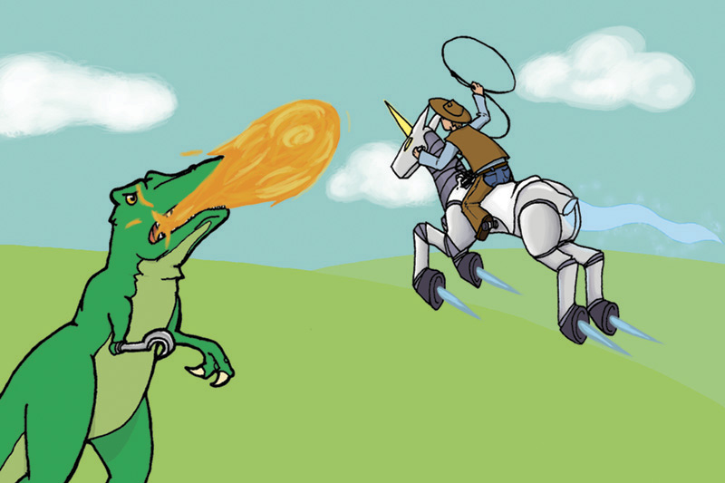
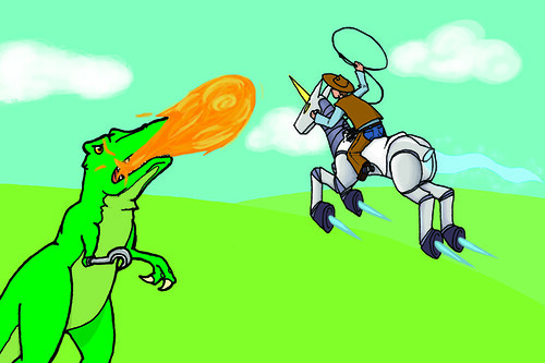
I started drawing... A cowboy. Riding a unicorn. No! Riding a... A ROCKET UNICORN! ROBOCORN!

But what would be awesome enough for them to f- T.REX!

And thus, this drawing. From there, I just let go and got as reasonably ridiculous as I could, escalating my idea of 'awesome' within the drawing - make the T.Rex breathe fire, make the exhaust magic - at one point, one of my sketches of the T.Rex had a wonky right arm; I got frustrated and gave it a hook. Just about everyone I showed it too afterwards demanded that I keep it in, so I did. Pretty cool, huh?

Oh, wait! The art, that's right!


Dinosaur-wrangling got a lot harder when they taught themselves to breathe fire...


At some point, there was going to be a field of, like, Triceratops or Stegosaurs in the fields behind them, but, er, it was... looking cluttered, yeah. I'll try to make it work, though, but... perhaps not when I have a deadline.

Details! The lasso is coming out of a spool-like-thing on the Unicorn's saddle-part - which is actually its middle, since it's a robot, it's built right in. The T.Rex's lines are a little thicker... but its eye is shiny? Also check out those clouds!

So, yeah, I also have to say that I might have been partially inspired by the likes of Dr. McNinja and Axe Cop. And this game from Cartoon Network that I can't link to you right now, but I'll edit it in later. And here we are!

(PS, you should totally read those comics I linked, seriously they are awesome. One is about a ninja who is also a doctor, the other is drawn by a 29-year-old artist, and written by his 5-year-old brother. That is all you need to know.)

OH, in terms of advertising myself also, after using the front to generate confusion and curiosity (confuriosity?), the reader will check the back and see text along the lines of 'You, too, may have this much awesome in your employ!' or 'You, too, can have this much awesome at your commmand!' something like that to advertise myself and my crazy brain. Sounds good, right?

-dusts hands, looks at posts- Huh, nice, all that work and it's not even noon! Good work, me!

PPS, kids, this is what happens when you try uploading a CMYK file to the internets:
NOOOO MY COLOURS

Groovy.

Thursday, April 1, 2010

Assignment [Ride for Cancer Research Postcard]

Yup! The idea here was to draw something nice and post-card-sized to hand out to people for donating to the Ride for Cancer event, and make it something that someone would want to post up.

For about a week I was waffling on using some terrifying huge-eyed cutesy character congratulating someone for making a donation, but then as I was reading something with my brother, we somehow got to talking about this achewood strip, and I was struck by a brilliant new idea.

At least I think it was the achewood strip. I'm not sure now, but if I were to put money down, I'd say that's where it came from.

ANYWAY

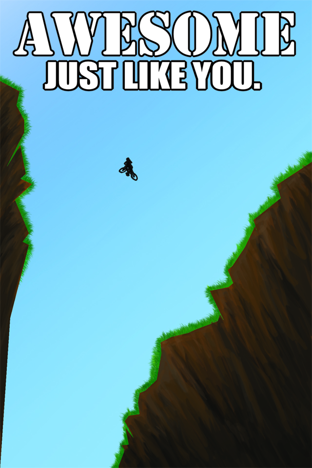
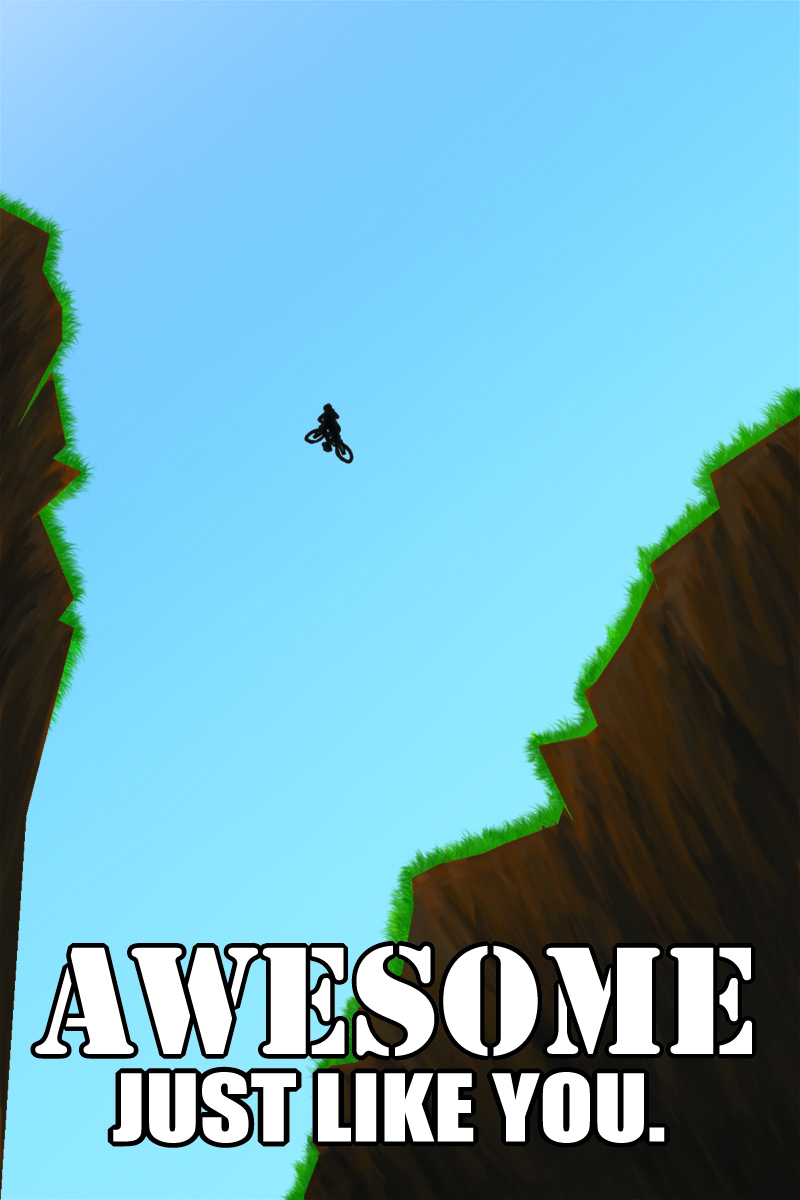
The idea behind this postcard is a bicyclist making a ridiculous jump across a huge canyon, an 'awesome' move, much like the recipient of this card donating money to a good cause.


I drew this entirely digitally, so no rough sketches, though I did muck around with the text placement. Originally, it was on the lower end of the card, but after leaving it for a few hours, I reopened the file and realized that the text was covering up and filling up the nice little canyon I drew, and decided that the sky was less important than the depth of the canyon. Soooo I moved the text.

The original:


And because I like it so much, the card without the text:


I think the canyon's edge might be a little sharp in places still, but I was having a heck of a time trying to get those corners blunt and still looking good. Eeehn. I kind of still like it like this, though, so there.

Assignment 2 [Storyboard: Trace]

... Yup. We'll just... pretend... this happened a month ago.


My younger brother was the model for this shoot, though I took some liberties with his hair (it's brown now), height (a little taller), and clothing (wearing a coat; not in track pants, clothing colours). I wish I didn't have to make him take off his awesome glasses, but alas.

So that's enough embarrassing my brother on the internet. I kind of blanked out on the background. But... For practice (not for anything I'd ever post seriously, though), I should trace some photos of mine sometime - just doing this helped me figure out the clothing fold thing a little better. And also the legs I've been sketching have been looking a little out of whack lately...

But enough trying to distract from this!

Wednesday, March 10, 2010

Assignment 2 [Storyboard Roughs, no reference] [ALSO LATE *SOB*]

[Scene: INT. DAY]

ME: HEY SELF GUESS WHAT
SELF: WHAT IS IT, ME
ME: EVEN THOUGH WE ARE WAY BETTER AT DRAWING WITH PENCILS, WHY DON'T WE DO IT DIGITALLY
SELF: SOUNDS GOOD I MEAN WE COULD USE THE PRACTICE
ME: EXACTLY NOTHING WILL GO WRONG HERE
SELF: I MEAN IF WE TAKE THE TIME TO IT
ME: BY THE WAY THIS IS DUE IN TWO DAYS
SELF: SAY WHAAAAT THAT IS SOME CRAZY STUFF


... I'm going to end that there and give my shift key a break (capslock is for wusses), but you get the idea.

This is late for embarrassing reasons I won't get into (the reasons are also lame), and these are subpar. I think tracing my own photographs might indeed be a better plan.

I was also going to do more than three because these three are pretty lame and also basically copy-pastes, but... time. Even though this is late. Just work with me on this.


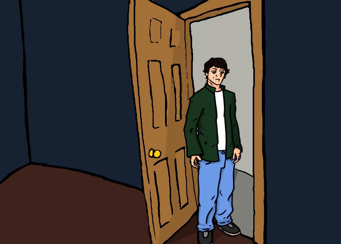
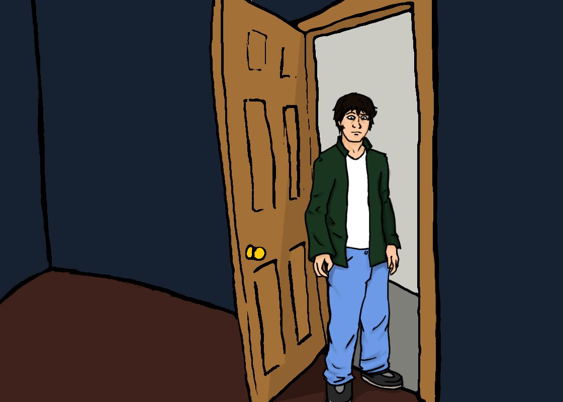
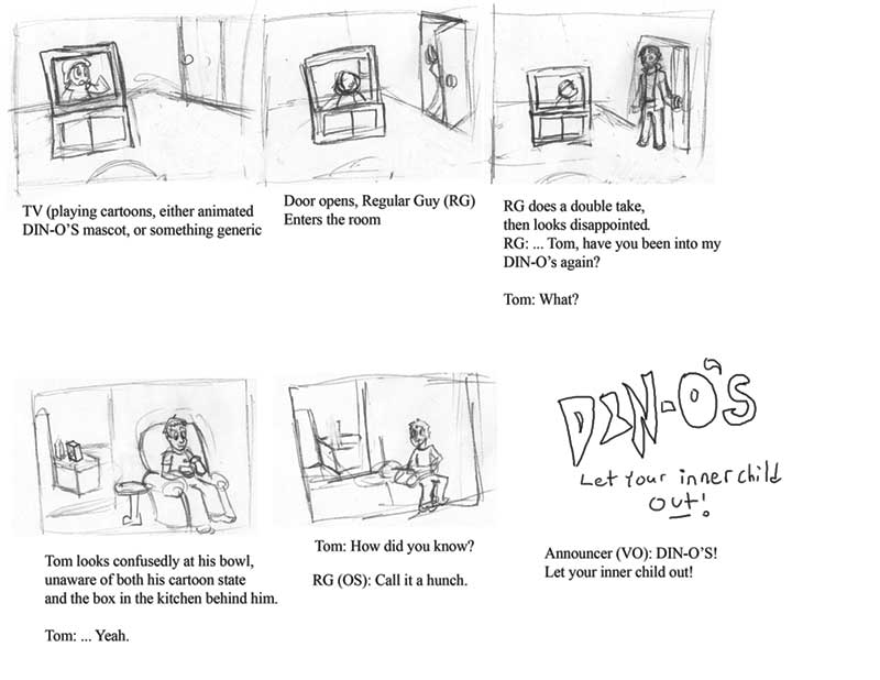
[board one: Cartoon is playing.]


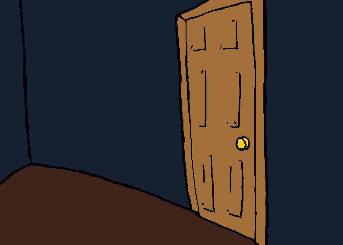
[board two: Door opens, Roommate walks in.]

Roommate: Hey, it's -


[board three: Roommate does a double take.]

Roommate: *disappointed* Aw, Tom, have you been into the Din-O's again?


And that's it. I... will either do more/improve this or abandon it and pretend it never happened when I get to the photo-traces. -( ._.)-

NEXT POST: Missed Illustration Friday, theme: ADRIFT. After that, hopefully, not-missed Illustration Friday, theme: BRAVE!
And, y'know, somewhere in between, another missed assignment, I'm sure.


[HUMOUROUS QUALITY LOGO]

Friday, February 26, 2010

Assignment [Blog Illustrations]

ARGH I AM FALLING BEHIND HOW COULD THIS HAPPEN
But more on this later.


Ahem, yes, assignment. These are some spot illustrations for this blog, right here, and I would tell more but I am so tired I am falling asleep at the controls. So! Let's make this brief!

I don't have a proper header illustration yet - I have a sweet concept, but, er, it's not quite done yet and I don't trust my sense of judgment when I'm in this state of mind (sleeping). So for now, here are two spot images as placeholders:


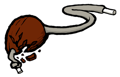
This is a chestnut, to be used just after this part: We all rode our bikes to find the source and ended up at the farm on which our chestnut tree stood. Terrible fire - barn burned down and a few animals were killed. Quite a spectacle for young kids. We stayed for hours and all got in trouble when we got home because our parents didn’t have a clue where we were.

Originally I was going to do some cutesy cartoony Reader's Digest-esque thing with kids playing this game, but then... I didn't, either I couldn't get the kids to look right, or I figured it was too complex for a little breaker image.

Soooo between that short story and its ending and stuff, I thought I'd draw the chestnut-on-a-string. Broken, to look more interesting, and because an intact nut would probably be in competition, not laying on some surface or another.

Also, its broken and discarded state would symbolize something deep or another in reference to the burnt-down farm, and then the eventual uprooting of the tree to make way for the campus. Like... the end of its era or something.
(Don't take what I'm writing too seriously right now, since it is like 2:30 and I have been sleeping terribly this past week so I am like REALLY tired you guys)

Er... as for my process, I drew it in pencil, inked it terribly, fixed it up a little in photoshop, and... coloured it. *thumbs up*

The same process more or less goes for this one:


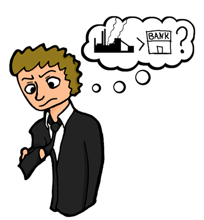
Which is an interpretation of Rick Court realizing that he is making less money as a banker than he did as a steelworker. Ah, those sweet summer jobs, right? *looks fondly back on that Riverboat kitchen... good times*

... Right, professionalism.

Alternate drawings for that thought bubble were a little $500 bill with wings, flying away, or $500 flying out the window, because I can do math and this is totally what was meant in that segment. Alternately, it was going to be a black tie, posed to mimic that chestnut earlier. With a $500 price tag, possibly. But... er, it wasn't working out, I think. I don't know, I just found this file coloured on my computer and the other one wasn't, so...

I SWEAR I will try to finish that other big illustration by sometime tomorrow! Really!

But for now I am actually typing with my eyes closed so I will return later with edits and wonderful drawings just you wait and see you guys
Goodnight everybody!

Wednesday, February 17, 2010

Assignment 2 [Storyboard: Thumbnails]

What are you talking about, this was here the entire time.


That's totally 30 seconds! It just looks short because there's not a lot of shot changes, since it's two guys talking to each other.

More on the excruciating task of coming up with this idea (and how it stumped some people) later! Or... not.