Showing posts with label Illustration Friday. Show all posts

Friday, June 11, 2010

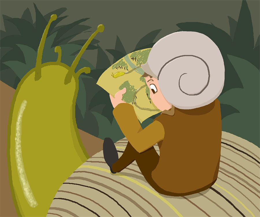
Illustration Friday: Trail (On the Trail we Glaze!)

Just a quick one tonight, kids, I gotta run.


Yup, completely digital, mostly lineless art. Wanted to play around with that.

I considered posting a smaller version of this, but in that one you can only kinda see the slug on the map.

Alternate titles suggested for this piece included "Snail Trail".

This might be the shortest post I've ever done! Which means I have to edit some long-winded explanation about the snail shell or the obscure movies that influenced this picture sometime tomorrow...

Friday, June 4, 2010

Illustration Friday: Slither

I told myself I wouldn't do anything snake-related for this prompt. Slither. It's just too obvious.

Then as the night wore on, my mind kept returning to how reptiles are often bad guys in the cartoons and movies and books I could remember, and then I started getting annoyed about that. Finally, I determined that what my reptilian friends need was better press, and what better way than a cutesy cartoons where they are the heroes for once?

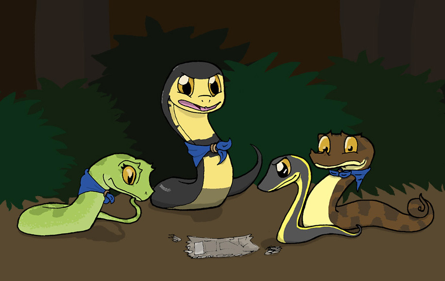
"Okay, gang, so whoever our litterer is, they're shedding. If I'm right, we can follow this trail right to them, but we might have to split up," Colby the Cobra said to his fellow Slither Scouts, and adding, after a moment, "Sorry, Horatio."


So yeah, here we have the 'Slither Scouts'(or Slither Squad, Serpentien Serpentine Scouts, something like this)! A club of a few young snakes out to explore and have fun and solve mysteries when they can).

Colby the Cobra there is the leader, and to the left is Vicky the Viper, contemplating the evidence. The little guy on the right is Greg Garters, who is not yet in the club and so does not have a nifty blue bandana. Hiding behind him is Horatio Hognose.

There's a Python and a Boa in the club also, but I was having trouble deciding exactly what species I would use as their base, and I was running out of time. If your eyes are keen and my hands are talented, then you might see that Colby is an Egyptian Cobra, Vicky is an eyelash viper, and Horatio and Greg's species are like right in their names, but I think Horatio is some manner of Eastern Hognose, while Greg is... the Common Garter, basically. Yeah, I know, some of these guys aren't even in the same hemisphere, but I'm going to play the cartoonish creative liberties card, and say it's more interesting to play with snakes from around the world instead of restricting myself to one country or continent. As well as the typical 'this is a world where snakes talk and solve crime and wear cutesy little bandanas and you have a problem with ' card also.

So yeah, I could rant on for a good 500 words on why snakes are cute with proof, and I could also go on about the personalities and stuff on the Scouts up there, but I am le tired and I need to also work on that 'posting/picture ratio' thing. Maybe when I sketch out these guys some more, I'll make another post.

... And yeah, the background is... not as nice as it could be, but the deadline was ticking closer and the snakes were the focus of the picture.

... Which either came out blurrier than I wanted it to, or I really ought to go to bed. I'm going to say the latter, because there are birds chirping outside.

HI ILLUSTRATION FRIDAY! Man it's been awhile. Next post will explain my lapse in posting, I swears it, right now I need to sleep. Did I mention how tired I am?

Friday, April 23, 2010

[Illustration Friday] Round 12: Linked

Alright, I'm nearing the end of this postingpalooza (unless I find more neat stuff to show you before time runs out), So here's another hand-drawn thing showing off something we all probably have experienced before:


There's always ONE.


Ah, HTML. I could be happily coding a table or a post, but miss ONE LETTER and the whole thing goes to heck. Incredibly frustrating, especially if it's like, a lengthy bit of story you wrote in a comment and now it is uneditable because you posted it but the code is wrong and you can see where you made the mistake and it's right there but you can't fix it--

Right, right, so, I liken this to those Christmas lights, y'know, where one bulb would go bad and then the rest of them don't work? I've never seen that personally (probably because mom and dad are like ninjas when it comes to getting out decorations; I could be in my room for an hour and then I'll leave and find the Christmas tree assembled and ready), but I have a feeling that searching through coils and coils of lights is like searching through lines and lines of text when it comes to this sort of thing. Assuming you only made one mistake, too.

Pen and ink again, with marker as the outgoing link in my hands there. I think my hand slipped on the jaw, but I kind of like it like that. Glasses are small so the eyes aren't completely blocked out by the frames, I hate it when that happens, and that's the only reason I still occasionally 'forget' to draw my glasses. God, my drama teacher was right about that, I never thought I'd agree...

Next post is going to be AWESOME.

[Illustration Friday] Round 10: Rescue

HERE WE GO AGAIN WOOOOO--

-checks drawing for this prompt-

--ooo, right.

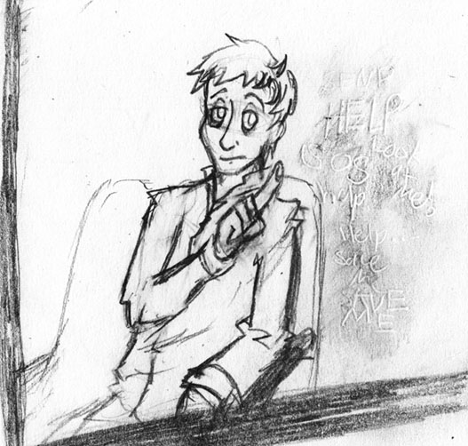
I was a little... Melancholy, shall we say, when this prompt ran, and most of my concepts ended up here:


How can you tell if someone needs rescuing?


Well something like that, to the effect of not all damsels and dudes in distress really show it. Because I was feeling really self-pitying that weekend (as usual, I put the blame solely on sleep deprivation, and nothing else *nod*).
I'm not sure if it came out quite as clearly here, though. That's supposed to be, like, that writing you do when you breathe on a window? Like that, so it's hidden unless you know where to look/breathe.

I did this entirely in pencil, with the words done by etching them in with a dead pen (and now the page beneath it has cool secret writing too!), and then going over it lightly in pencil, and then blurring that pencil with an eraser. Done and done.

I probably should have darkened the space behind the dude, though, but eh, next time.

I seem to swing between childish-ridiculous and whiny-depressed. Curious!

[Illustration Friday] Round 7: Brave (missed)

SO YEAH I really actually like this one and I wished I finished on time (partially because I had that texture technique fresh on my mind at the time, and now I forgot it).

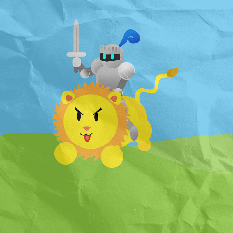
For this one, I thought about brave things. Knights are brave. Lions are used to represent bravery. When you're little, you try to be brave and sometimes wanted to be a knight... Well okay maybe that's just me (and my steed was totally a dragon, not some silly little lion), but still!

With the childish thing in mind (and because I like doing simplistic drawings sometimes - feels like taking a break, y'know), I went forward with this! ... Several weeks after it was due!

... I should probably stop going on about doing things late. >__> Well, I mean, I had like five other things to do at the time but--

RIGHT. CUTE ART.


So I did this little number up in Illustrator, but I forgot how to properly, like, put textures on individual pieces because I'm a pro. I will bet you actual money that I remember how when I get home tonight (in which case I'll redo this and add it to the pile of 'remixed art' I'll release some time). I should probably not talk about me forgetting things too.

Ahem, right, I still wanted to throw down the papery texture, though, so it felt like a children's drawing or something out of a kid's storybook. ... In this case, a well-worn storybook. Because... it's real popular, yeah, that's right...

Honestly, there was a period there where I was afraid I was going to really hat that knight when I was done with him but he turned out surprisingly well! I did some neat little multiply-transparency-gradient to make the armour shiny, and gradients for the little visor-slots and the shading on his feather.

The lion, I had a decorative brush, I think? I had one of those outline a circle, that's how I got the mane down. It worked better than I had hoped!

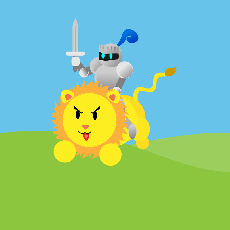
So yeah I really like this. PS, here's a version without the texture so you can see it in its original eyeblinding glory:


Yup! That's all for this post.

... Y'know, I should draw cutesy things in Illustrator more often...

[Illustration Friday] Round 4: Adrift (missed)

So, yes, this is one of my old Illustration Fridays that I missed and thought 'oh well, I'll finish it later and it'll look awesome'. Yes, well, apparently, I need these Illustration Friday submissions for, like, marks. WHOOPS.

SO, here is Adrift:


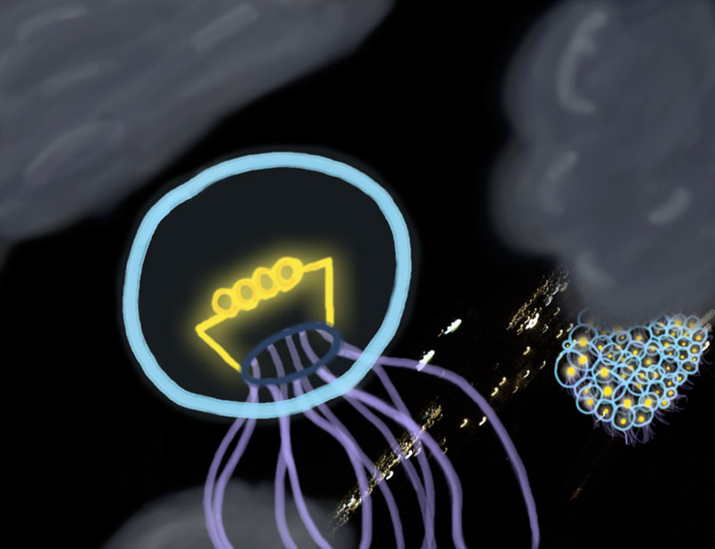
Oh no! A rare sky-jelly has been knocked astray from his cluster! Poor little guy!


*ahem* There's a bit of an embarrassing story behind this, as I was all set to use a nighttime city background to make it look like he's drifting high above the earth, but not having any on hand, I hit flickr. I realized that this was one of those things I'd need permission form, but I am way too shy, so I asked 'is it okay to just use this if I link back?'

It was one of those moments where you realize you're saying something really, really stupid the moment you open your mouth, and you can't stop yourself - you can only listen to yourself ask that dumb question in glorious slow motion. I'd like to say I was tired or desperate or something at the time, but ehn, no excuse. God, I felt dumb that day.

Yeah, no, you can't just use stuff and credit without asking. This isn't DeviantArt, after all.

SO YES, don't worry, with all the extra time I got after missing the Illustration Friday deadline, I had time to scrounge through some old pictures of ours and found a blurry .JPG of Toronto at night that we took from a hotel one of the years we were at Anime North. Good times!

Actually, with a little tweaking, it worked. It kind of looks like a city street or something, right? I mean, technically it is, but it looks like it's from real high up right?

... Yup, and thus begins post one of the post-a-thon today. (Why yes, today is my last day of class, how could you tell?)

Friday, April 9, 2010

Illustration Friday [Round 11: Dip]

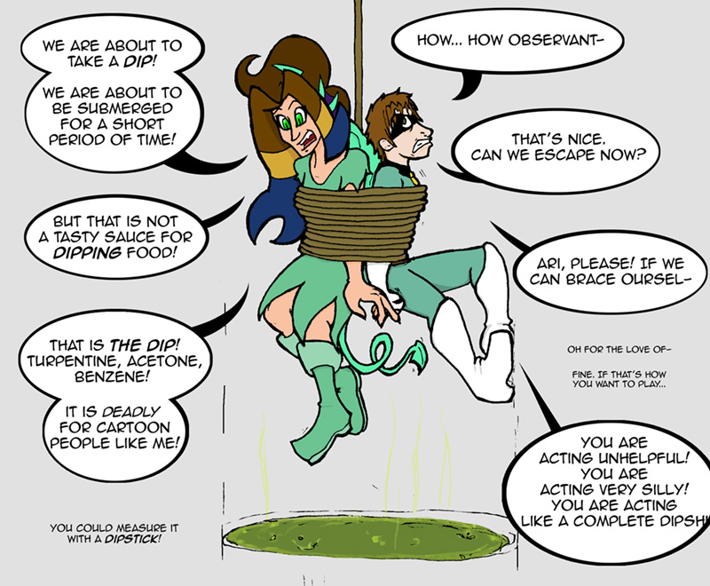
As usual, after sitting and ho-humming (I think that's a verb now) over some design or another representing my deep insecurities, two ideas collided in my mind as I tried to figure out a better interpretation of the 'dip' prompt on Illustration Friday. Then I started going through definitions, and somehow, these all connected in my mind:

1) The Super Dictionary, from DC comics. I wish I could tell you more, I wish I even knew where to start linking, but the best I can do is link you to a Google image search like a pro and pretend I accomplished something.
For the link-phobic, essentially it is a dictionary for children with definitions illustrated through various DC superheroes. Needless to say, er, more than a few of these definitions seemed a little oddly placed, scenario-wise, or downright confusing, but overall, hilarious (Forty cakes, anybody?).

2) The Dip, from Who Framed Roger Rabbit. You know the one. Paint-thinner, designed to kill your favourite cartoon characters.

... Okay a little melodramatic, but you get the idea. But how could I use the dip for illustration Friday?

This somehow ended up with idea three. Remember that bit of original art I posted a few weeks ago?

Well, she's technically a superhero... and in her story which I haven't elaborated on before this moment includes something like a cartoon character come to life, so...


Well that certainly illustrates the diversity of the word


And... yes. I am awesome and apparently picked a colour theme for my characters that does not translate well to the web at all! Woe is I. I... Will fix this somehow later. In the meantime!

Yes, the one on the left is supposed to look like a ridiculous anime-character. See, in-story, she is... Well, she's a thing that based her form on someone's childhood imaginary friend. The girl on the right, actually. Also known as the Animator. She controls ink. Together, they fight crime! Kind of. Fascinating story, really.

And yeah this is typically how they interact on-screen, at least in non-plot-significant situations; with Ari the anime-thing making hilarious off-the-wall comments and pop-culture references, and Annie over there trying to hang lampshades and criticize the typical stunts and situations of the superhero genre. Genius!

Though I will admit, I usually don't go as overboard with Ari's hair. I was just having so much fun drawing this though, I didn't want to fix it. Honestly!

... Though something's bugging me about the word balloons, but I guess I'll just have to agonize over that until I am awake enough to make good decisions again.

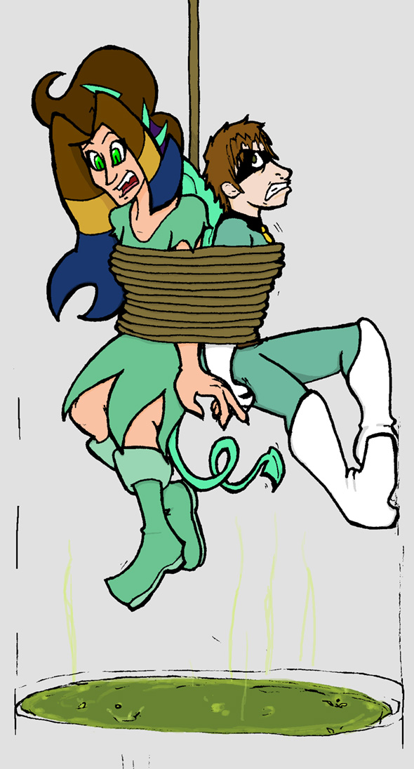
So, yes, because the dialogue looks a little cluttery to me after staring at this project for a few hours, here is a smaller version sans text:


Tadah!

Which reminds me, I swapped out my header for one with Ari in it, since she's in this week's IF post and all, but I'll switch back to the dragon-guy, or maybe someone else. See, I originally intended to have a rotating header bar, but, uh, ehe, I only had one header to use at the time. Now I have two!

And yes, I'm sure you'd love to read more of my lovely and eloquent writing, but I am very tired right now so I am going to bed. Thank you for reading and stuff, the usual!

Friday, March 26, 2010

[Illustration Friday] Round 9: Expired

Yes I know it's a little sketch, but darnit, I'm going to submit something for Illustration Friday this week!


Originally I had a page of comic planned out and half finished for this prompt, but, er, then, you know, other projects came up, the usual. But, determined to submit something, I sketched out what was basically the main punchline - this guy, the main subject of the page - and that tag. ... It was pretty much the first thing I thought of when I saw 'expire'. Well, that and some convoluted way of connecting it to the patchwork pirate since I wanted to draw him again...

I went with this partially because the concept was clearer here (Pirate was going to uncover some ancient treasure with an expiry date, so), and also because I like zombies. ... Yup! Not much else to add!

And for those of you tuning in from class, especially if you are marking me, I will have not one, but TWO postcards tomorrow (or Saturday, because let's face it, it's me), and then... MORE!

Yup! I mean, aside from the catching-up things, I have been itching to post some non-school related art, and hopefully I will get to do so this weekend! So mark my words, there will be a post every day this weekend! Or at least tomorrow and Saturday.

See you then!

Friday, March 19, 2010

[Illustration Friday] Round 8: Subterranean

Iiiiiiit's that time again! Illustration Friday!

ahem

I can't remember when, but somewhere through my childhood, I picked up one of those books full of fun facts about various things. I think this one was called 'Bugs That Go Blam', as it was centered around bug trivia. There was a ton of weird stuff in there (that, looking back, might be inaccurate in parts), but one thing that I remember as kind of jarring was this one fact about the Cicada: Some types can spend up to 13 or 17 years underground, before they crawl out as adults. I think the part that struck me the most about that their long lifespan - there were bugs out there older than I was! - and the illustration depicting a teenaged Cicada larvae chilling in his underground home and watching TV. The fact made some joke along the lines of spending most of their life just eating and living underground. I think part of me was unnerved by how much of the insect's life was spent underground, while the other part of me kinda wanted to be that Cicada.

... Well! Now that I have the rambling story-set-up, let's get this trainwr- post rolling! :D


You ever have one of those days where you don't feel like getting out of bed?


Tadah!

I think I was originally going to do something with molepeople (Sam and Max or The Tick, pick your inspiration), but then I remembered the cicada and its crazy life cycle, and decided to go with that.

I seem to work better/more reliably with non-digital media, and this time 'round, I used these bright Staedtler markers I had lying around. I felt they suited the brightness of the cicada's wings and eyes. Though, now that I'm looking at it again, I think my scanner did something odd to the colours. Hm...

Initially, I was also trying to stick with colour combinations that are likely to happen in real life, but then I started having too much fun drawing the little cicadas having their waking up party. Also this was going to represent some deep-seated anxiety of mine or another but then I was too amused by the little pouty cicada faces to get into the right state of artistic depression. Lookit them! Heh heh heh.


And to make a long post longer, news!:
- Finished Storyboards to come soon, possibly a missed Illustration Friday.
- Will try to upload some non-school stuff, or at least non-portfolio-class-stuff. Will just have to pick the best of the lot.
- Also, you know it's bad when your own mother is telling you to stop being so self-depreciating and act more professional. *waves* Hi mom!

And that's all for now, folks! See you next random update!

Thursday, March 4, 2010

[Illustration Friday] Round 6 (ish): Perspective

Me: Golly, what was I supposed to be doing? I don't know... I have a feeling it's important...
Conscience: It's your homework.
Me: I could have sworn... it's on the tip of my tongue.
Conscience: *coughHomeworkcough*
Me: A nagging thing at the back of my mind. Man oh man, it's like right there, what is it?
Conscience: Is it your homework? I think it's your homework.
Me: Darn, I guess this is going to bug me all night...


WHOOPS It was Illustration Friday! And to a lesser degree, my other assignments!

I am sure I have a plethora of long boring predictable excuses as to why I haven't done this in awhile, but uh. They're not really important, the end result is that I didn't finish on time! I will post my missed I-F's later this weekend, but in the meantime, here is my take on perspective:


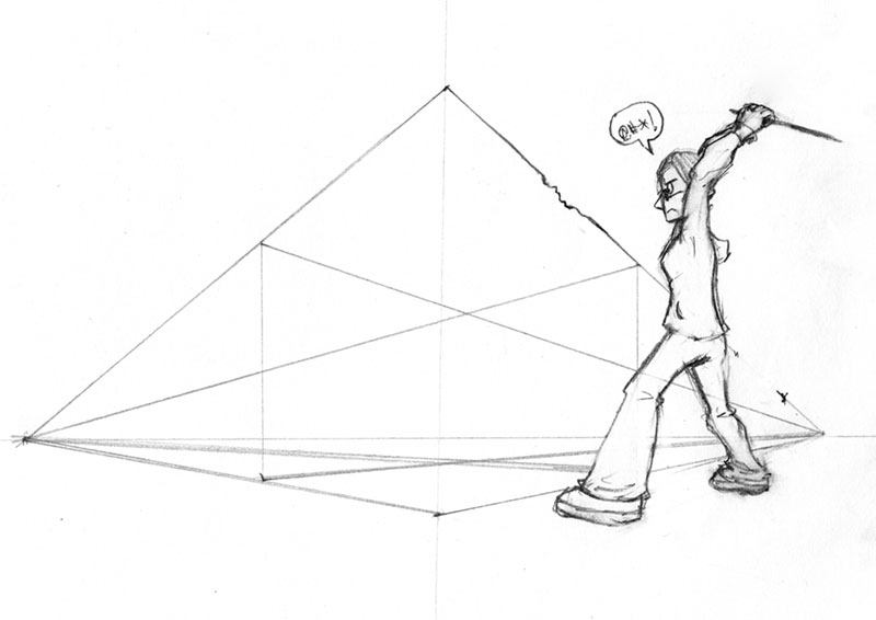
Whenever a teacher told us to use one or two point perspective, I would silently break into a cold sweat and a string of curses. Perspective is one of those things you could really, noticeably screw up, and I was terrible with straight lines and believable buildings.

Plus I have a short attention span and would rather be drawing cartoons and characters over perspective guidelines.

On a note about the actual artwork, it is all pencil-sketchy mainly because that is the usual stage that those perspective guidelines are visible and used at and so on, and it would look weird to have all or part of that inked, so, I left it as is. I probably could have cleaned it up a little more, but, um. I... was in a hurry when I scanned it. Yes. That's it.

Not to say I hate using proper perspective and guidelines and such. Just that I'm really paranoid when I am using them. I mean I'll get over it one day, but until then, I'm going to be nervously measuring and remeasuring lines (then giving up and making a ballpark estimate).

Ladies and gentlemen: a wannabe comic-artist! :D

[image advertising my QUALITY ARTWORK goes here]

Tune in next week where I'll draw myself beating up a mannequin representing my dislike for proper proportions in human figures! [/requisite self-depreciating comment]

QUALITY.

Thursday, February 11, 2010

[Illustration Friday] Round 3: Muddy

It's that time again! Illustration Friday time!

When I was younger, I had a fear of deep water. When we went canoeing on our yearly camping trips, I would nervously look over the edge to see how deep we were. I'm not sure what I thought was worse: clear water, that let me see straight down to the bottom of the lake, potentially revealing the creatures living amongst the weeds, or murky water, that hid whatever secrets it had.


Hahaha, yup, not quite as dramatic as my intro paragraph, but... When I heard Muddy, I thought something lurking in muddy water, because that's how I roll.

Actually, I kind of pictured dogs and cats covered with mud, or some manner of muddy pawprints, but eeehn, it's been done, and probably better.

I originally wanted to do this in watercolour, but I... don't have a lot of space on my desk at the moment and by the time I get home at the end of the day I'm really beat (That's my excuse and I'm sticking to it). And since I'm still transitioning to using my fancy computer programs to colour/draw stuff from never ever using them, I thought I might as well work it in.

I was going to try throwing a texture on, but I also realized that my scanner picked up the page's texture, so I just... cleverly kept that in.

Also, those pencil lines, are just... I wanted to go for kind of a sketchy look, I guess, for a poor-visibility sort of thing.

I think this is how it looked in my mind, overall, but... Something still feels wrong about it. I don't know! What do you guys think?

PS this is an alternate, without that sloppy brush-thing on it:


IN OTHER NEWS: Still can't comment on other people's blogs; either my anxiety problems uploaded themselves to blogspot, or there's some weird formatting problem. I changed my comment window style-thing on my own blog, and now I can comment on my posts, whereas the default settings apparently hate me. Man, this is embarrassing. HOW DO I USED BLOGSPOT?!

Aaaaaaand that's enough looking professional for one day.

Thursday, February 4, 2010

[Illustration Friday] Round 2: Focused

[Er, right, this post is for Illustration Friday! Though I think it's more likely that people are coming here from there instead of the other way around, but...
Also also, I seem to be having problems commenting! I swear it is because of some sort of dark sorcery and not a lack of knowledge on my part!]

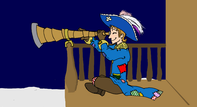
I alternated between a little sequence of sketches, to kids measuring baking stuff, to a pirate sitting on a busted dingy on the moon, and cycled through them until I started drawing the kids and ended up with this guy:


I... Planned on more for this picture, but time and lack thereof totally got in the way (and not skill whatsoever) and I could not finish the awesome scene I had envisioned from the start. Man, I hate it when that happens!

So I haven't seen The Adventures of Baron Munchausen in like, forever, but it's one of my favourite movies, and one scene I remember clearly is when they fly a ship to the moon. They either just landed it, or they were actually sailing across the surface of the moon as if it were water. Whiiiich is what I tried to get across here, but... Er... haven't, quite.

In my original idea for this thing, I was going to have a bigger scene, where you see this patchwork guy's boat, which is also tiny, and also has patches on his boat and sail. And stars in the sky. Also his eyeglass/telescope was bigger! And shinier! And had neat little things written on it! And everything else would be shaded!

- Ahah, but that will be later, I promise (and really mean it this time, guys).

The, er, rest of the idea was that he was focusing on something in the distance, and despite the fact that basically everything he owns is patched up in some form or another, and his boat is tiny, and his hat doesn't really match his coat, he's still eagerly planning his next moon-pirate thing.

*thumbs up*

Thursday, January 28, 2010

[Illustration Friday] Round 1: Wilderness

MAN oh man I have terrible luck with Google accounts, but that is a rant fit for livejournal and not this delicate art blog of mine.

Anywho, as a part of this portfolio class, we are completing challenges for Illustration Friday (though not submitting them... yet), and last week's challenge was wilderness.


There is a graphic novel series I used to read (and will continue to read when I have the money to buy the volumes I'm missing).

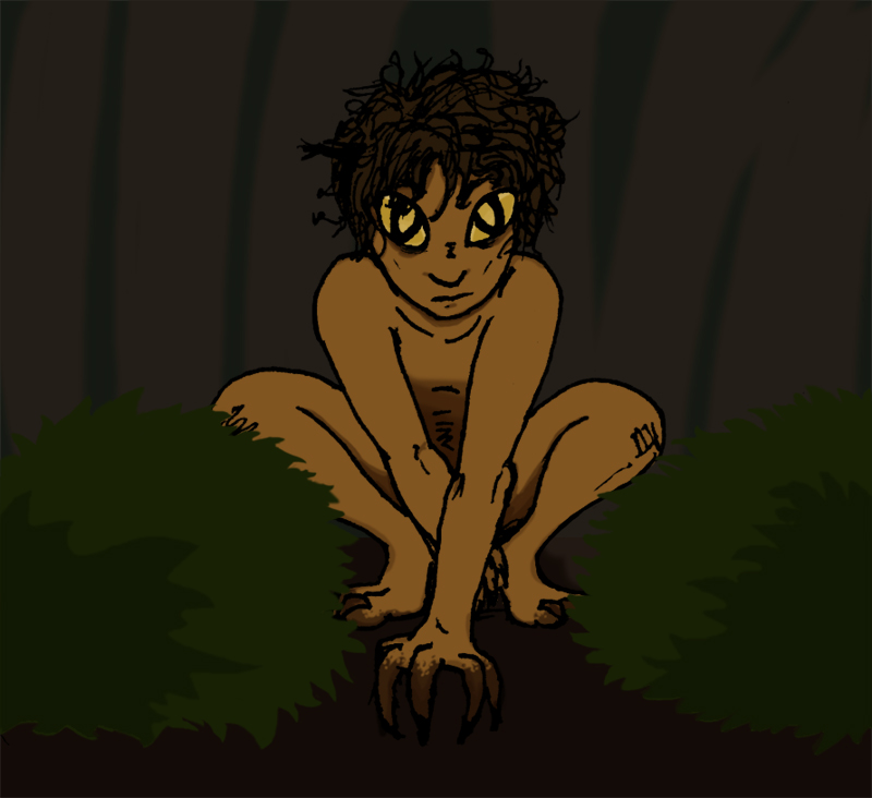
Bizenghast, I believe, and to poorly summarize it, a girl accidentally signs a contract with the guardians/caretakers of a mausoleum to put the restless spirits it was holding to rest. One chapter dealt with the spirit of a boy who was a wild child, abandoned in the forest at an early age. He had an interesting design, and had a closer connection with the wilderness than with humans. I won't spoil it, even though this was like in the first or second volume, but essentially, when I saw the prompt, I kind of thought of him.

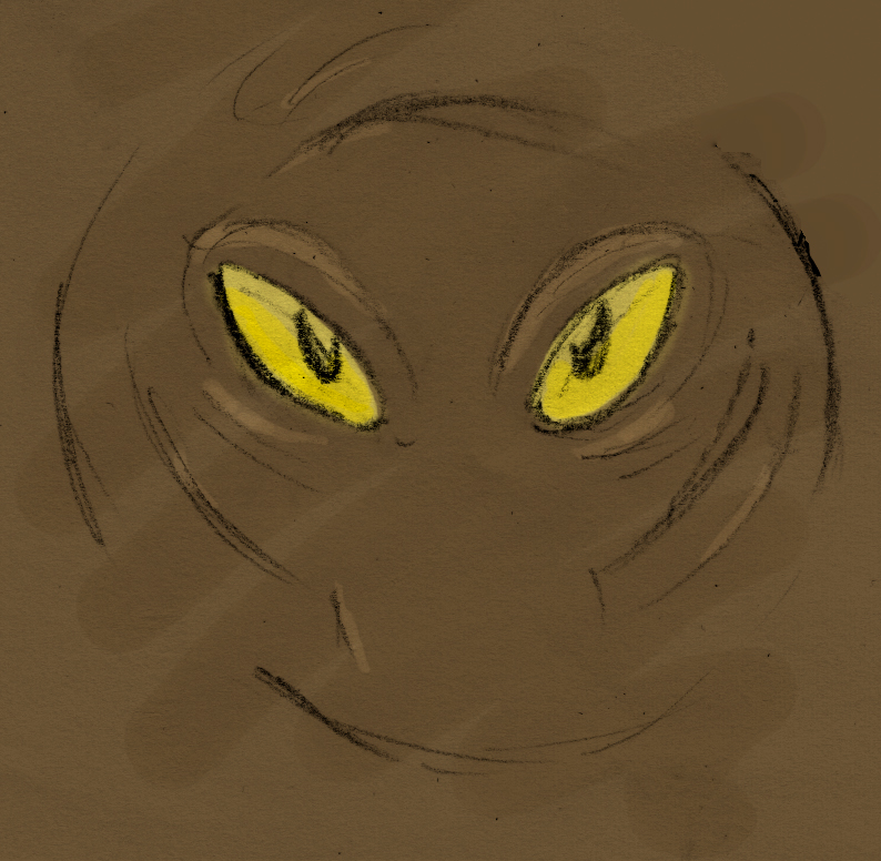
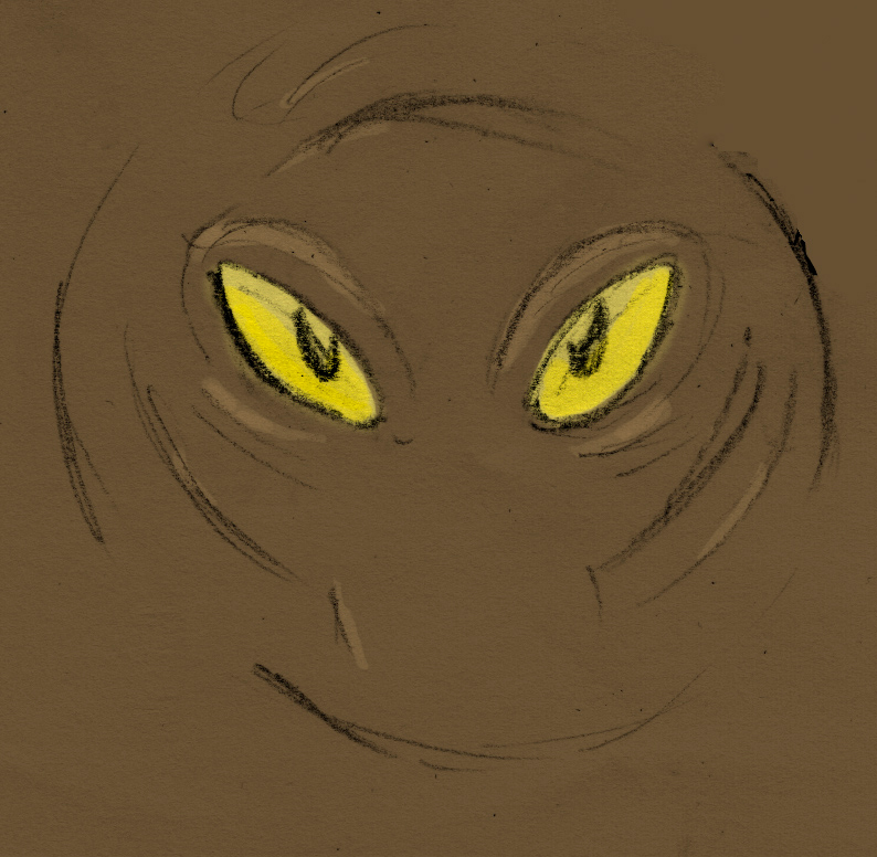
... okay, at first, I was thinking how to tie it in with dinosaurs since I kind of want to theme this blog around that eventually, and had a neat shot thought up involving my little explorer stegosaurus wandering around and/or getting stalked by raptors, but that was kind of hard given that I have never really painted anything from scratch digitally (as you can probably tell). Then I was thinking of drawing someone looking out of a window at some forest, since that's pretty much what I did all throughout school, but theeen I was drawing eyes - I kind of do that idly when I try to think of things to do - and drew one that kind of looked like this wild boy's eye.

So... Yeah. I don't think I drew him accurately, since it's been awhile, but I kind of hope I didn't copy exactly, either. I meant this to be more based on him than straight-up fanart anyway, but I guess I won't know until I find that volume again.

And here is the non-saturated version - I think the first one looks better, but eeeehn, I kind of want to know what the TONS OF PEOPLE TOTALLY READING MY BLOG think?


... I actually am... I suppose I am content with how they look, but I know I can do better - I really rushed the shading and background since I totally started this last night - ran out of time or something. I could really stand to sink some more time into that, which I will totally do... one day.

Also wildboy there would look better if he were smaller in a larger composition with the forest, maybe. Like, he doesn't have to be staring out of the shadows in a huge canvas or anything, but... more space would be better. We will see!