Tuesday, December 14, 2010

Nidd the Dragon

This one less obviously than others, but hey, look! It's a vector dragon!

NIDD Vector

This guy is called Nidd. As my Flickr description will say, he is for a children's story I am very casually writing notes for. He appears as a statue in it, but I wanted to draw his true form for fun and for reference.

I originally was going to try making him more 'Norse' looking, but as I researched that I found out that Age of Mythology totally lied to me, and the dragons up north are more like big serpents. So I gave him more of a snaky body, realized he was looking a little oriental in style, and then something occurred to me. There was this museum exhibit I went to while I was in Edmonton (that was mostly for children, admittedly), that talked about dragons and their origins in human legends and history, and mentioned how some were pretty much a mish-mash of animals.

So I thought I'd try my hand at that. I tried to give him a wolfish, horseish head shape, with long horse/goat ears, antlers, a snake's body, thick fur (either wolfish again, or something with a thicker coat), bird's legs, bat's wings, and a tail of my own design.

... What?

Anyway, for this world, I figured dragons were more of a description than an identifiable species. Y'know, magic creatures, right? And the kind of dragon Nidd is are shapeshifting types anyway, so your guess is as good as mine when it comes to putting science to them.


The background, as usual, was an afterthought, but I wanted a colour that would make the drawing pop out. Somehow red was chosen. For the real thing, though, I'm not sure. I didn't draw him with a background in mind (probably because I didn't initially plan to post this to the blog, eheh), but maybe I'll draw the carnival he works at in later... Hm...

Well, until then! See ya later!

Evolution of a Character

/ What I've Been Doing For Four Months, Part 1

Hey, remember these guys? Or at least Nero?

Well, y'see, one of the side effects of drawing every day (even if I don't post it) is that your style changes. Usually for the better. Sometimes, you can notice that change over a month, or sometimes even a week.

Blah blah blah, dramatic build up, hey look at this!

Page WIP

Sketched on paper, then scanned and inked and coloured in photoshop!

Still a Work In Progress, though. I keep doing this multitask thing, look where it's gotten me! ANYWAY, yeah, the backgrounds very obviously need work, and admittedly, I mostly put them there so there wouldn't be huge gaping blank spots behind the characters I was so proud of.

But yeah, my point is, hey look! Spot the differences!

Yuu's wings are better! And I figured out what his suit looked like! And his hair is - well you can't see it here, but his headshape and hair are better than in those early doodle pages.

Nero's got a larger and pointier chin, likewise with his nose, and his hair has flared out into four spikes on top, and however many I feel like for his bangs, because I had to draw him repeatedly for a project I will mention later, and the best way for me to stay consistent was to cut corners.
... Uh.

And Krii is- not in this picture, but rest assured his structure is better too.

NeoNero

That's all I have for now! See you next post!

WIP it good!

Well, it's not Wednesday, but this is a WIP that I kind of like and would like to show to the world before I ruin it further!

Magical Warrior Drakaina!

There's a long story behind this starting with me jokingly creating a fan-character for Sailor Moon based on the stars of the constellation Draco, but then she, er, turned into her own character. Tadah!

ALSO the title says this is a Work In Progress. That is because her right hand will be holding a sword (that will block her nice shoulder-frills and mouth), and also I have to put shading to it. And probably pick a better hair-colour, and a less eye-burning and rushed background.

Professionalism!

But yes. More on this when I have a more finished version to post, hopefully with her sidekick/ward/boss. That's all one person, by the way.

See you in five minutes next post!

Wow look at the time!

Well it's been about four months since my last update! Funny story, really, which I hopefully will get to in the next post. As it is, I'm speed-updating to make it look like I am a very active blogger and illustrator!

Look!

Mouth Creatures

I call 'em Bocas, probably after ten minutes of looking around Wiktionary for a word that means 'mouth'.

I made this for this group I'm in at deviantArt, but I am reluctant to link to my dA activity because that is way more casual than the tight professional image I cultivate here.

Er. Biology notes! They don't eat a lot, given that their mouth and eye takes up most of their body; the trees they normally nest in bear fruit that looks like them... but they don't exactly have the brainpower to know this, so you could just as likely find them in an orange tree; their children resemble burrs and stick to the fur of passing creatures to get carried to a new location; they can reel themselves up or down or swing from their tiny little legs; and they will eat anything they can fit into their mouths. Fortunately they are about the size of a grapefruit, maybe.

That's all for now, tune in in five minutes!

Tuesday, August 31, 2010

More Snakes!

And when I said 'this weekend, with sketches', I meant 'two weeks, with more snake drawings'.

*ahem*

So, I've got the five-man band complete with these next two:

Paul Python:
Paul Python WIP


A ball Python, I took some artistic liberties with the pattern, and then I played around with the colours... I definitely prefer yellow and black. Yeeeeah, I also don't have any shading here quite yet, since this is more of a pattern/design/shape/colour test, and uh, my other flimsy excuse is that I missed a week once already, and if I don't update now, I might miss another one. ... Also I'm excited to have these guys done up because cute toon snakes, am I right? :D

Bella Constrictor:
Bella Constrictor WIP


Much thought was put in to how terrible of a pun her name would be. Other suggestions were Beaux, or Bo (back when I was also wondering if she was going to be a guy or a girl), but I like this one better. It's so terrible, it's perfect. >wipes away single tear of pride<

Oh, right - I know snakes don't have eyelids, but it's important to making them more expressive.

Soooo yeah, I ran through making her greenish with a brown/red pattern because that's what Boas are like in real life, and then I googled Boa Constrictor colour morphs and got creative. I found a pinkish one somewhere, and I was going to use that colour to compensate for Vicky's lack of pink. Alternately, I could just make her more of a burgundy/red style... But then I run into problems with colour uniqueness and the rest of the team.

Speaking of,

The Team:

Snake Squad Groupshot


As you can see here, I'm already having problems with Colby not standing out as much, since Horatio is almost the same colour of tan as Colby, and since Paul also features black in his colour scheme... Eh, I'll work it out somehow.

And... That's all for now, I think! Maybe this weekend will be the lucky one full of fun sketches!

Thursday, August 19, 2010

WIP Wednesday - SNAKES OH MY GOOOOOD

Well, it's been a fun little break, hasn't it? That is totally it and not forgetfulness on my part.

Well, actually, I was camping for about two weeks back there. So yeah! Which, actually, led to a lot of neat stuff in my sketchbook, which I will try to scan and upload this weekend. We will see, we will see.

In the meantime, it's WIP Wednesday! And it is still totally Wednesday because I haven't gone to bed yet! And on that note, we see the return of the 'Late Night Theater with Rex', there to absolve me of any posts full of fatigue-induced typos and dumb wordings!

**Also also, on a technical note, something weird is happening between flickr and blogspot and I am waaaay too sleep deprived to figure it out and make it pretty again, so as a consequence of that... uh, you'll get to see into my flickr account too, I guess./professionalism**


Aaaanyway, today is a very special episode of WIP Wednesday. Not only have I accidentally made it an actual feature instead of just a one-shot-joke, but I have something new, something strange, someth- OMG CARTOON SNAKES YEEEEEE--

Ahem.

I've been playing around with the dudes from here, sketching them and then drawing them in Illustrator. Interesting process. Blah blah blah, more padding about the process and my thoughts on the matter, and now snakes.

Starting with Colby the Cobra:

Low Res Colby Cobra WIP

I was playing around with his colours, mostly because there may be other snakes that have black or brown as a secondary colour on this little team, but the general consensus so far is that black and tan is the best combination thus far. So, yeah, will probably go with that when I make fancy wallpaper for him later. *cough*

Low Res Vicky Viper Vector WIP

VICKY I love you more every time I draw you~~~!

Ahem, excuse me. See, Vicky is an eyelash viper. Again, I'm playing around with colour combinations, and now, patterns as well.

See, the problem is, I like her in green, but I have seen a picture of a pink morph on the eyelash viper (among many, many others), and my brother is insistent that I not give up this opportunity to have a female animal character that can actually be pink and have 'eyelashes' in real life. I am torn between this, but since she is my character and not his, I'll probably go with green. This is okay because if I am to believe every breeder site I read, pythons and constrictors can sometimes come in pink. Pinkish. Albinoish. -ahem-

The yellow morph was thrown in for kicks. So, yes. To my Mom, what does you and your office think? loyal readers, what do you think?

Low Res Horatio Hognose WIP

And finally, the most WIPish of the batch today/tonight, but my favourite snake in the group, Horatio the Hognose snake.

Seriously, Hognose Snakes are awesome.
Normally I'd be happy and willing to give you the spiel on why these are the best snakes ever, but I'll let this youtube video of its defensive techniques do the talking.

Aaaanyway, I at least put in the effort to give Horatio a pattern on the top left. Probably not an accurate one, though. The others are more bases to pretty up when I am not tired, but also there so I can have fun with his expressions. Man, he's the best.

I know what the last two in this snakey five-man-bad are going to be, their names, and what they look like, so they will be... um. Let's say next week. *bites lip*

So... yes, I'm still alive, and still drawing ridiculous stuff. Hi guys!

Friday, June 11, 2010

Illustration Friday: Trail (On the Trail we Glaze!)

Just a quick one tonight, kids, I gotta run.


Yup, completely digital, mostly lineless art. Wanted to play around with that.

I considered posting a smaller version of this, but in that one you can only kinda see the slug on the map.

Alternate titles suggested for this piece included "Snail Trail".

This might be the shortest post I've ever done! Which means I have to edit some long-winded explanation about the snail shell or the obscure movies that influenced this picture sometime tomorrow...

Thursday, June 10, 2010

Sketches - Chase and Margaret

So, yeah, I missed a week or so of posts due to falling horribly ill shortly after that post with Anna (and by 'horribly ill' I mean 'mild cold', but whatever), and I was actually unable to draw. And then there was a convention, don't know if you heard of it, but Anime North? Yup, recovered just in time for that, and the week before it was spent with family frantically working to get ready for it. But... Those stories are better fit for Livejournal, or, maybe, a different post someday. Costume Making is kind of like art, right?

But I digress.

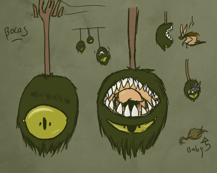
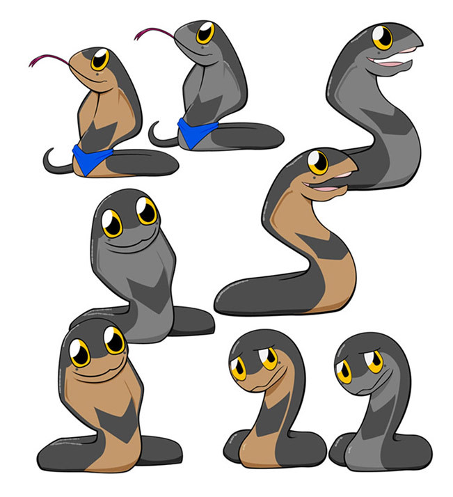
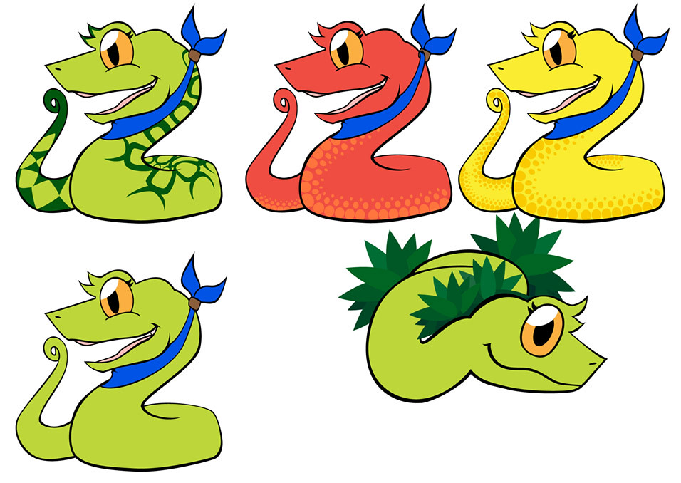
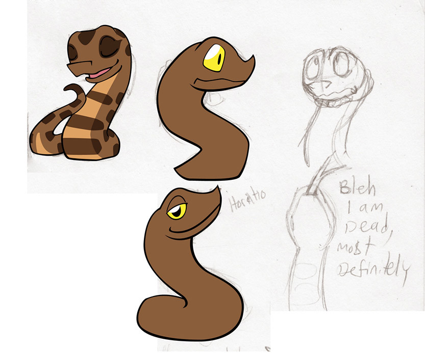
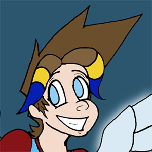
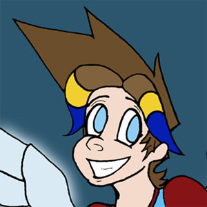
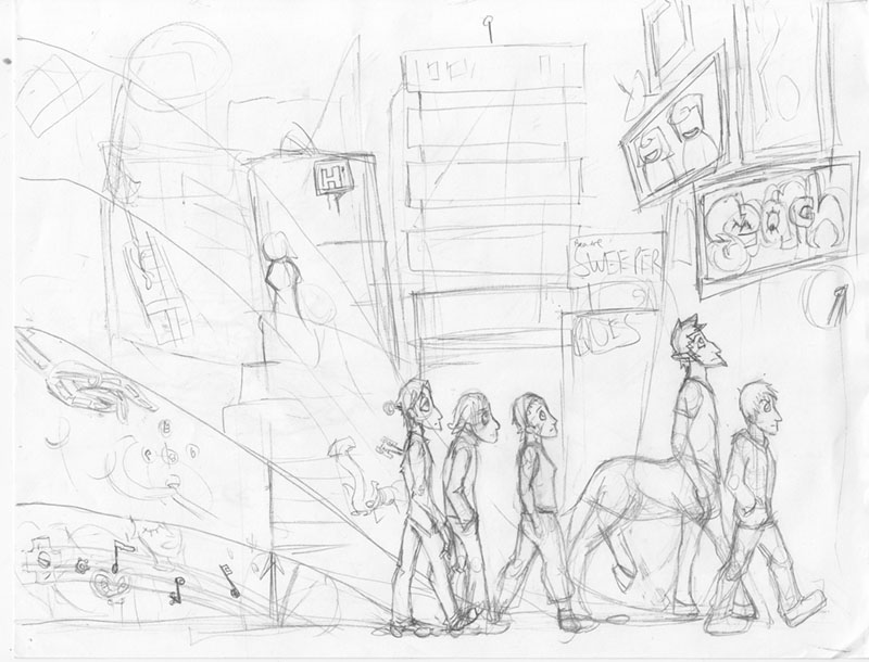
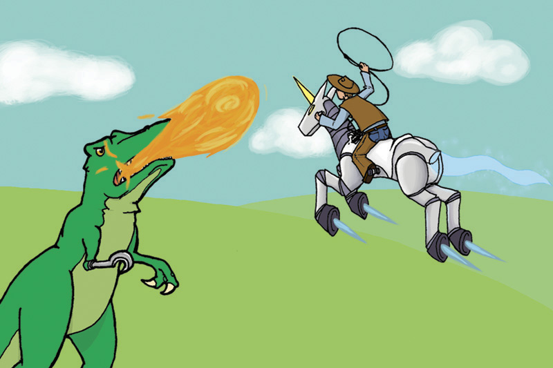
Today is another post featuring things I drew in my sketchbooks and scrap paper. I think these guys are some of my more interesting characters, for their origin, if anything else.

See, one night, I had an incredibly vivid dream about this futuristic utopia-sort of world. The short version was that there was little poverty and no crime; everyone was happily living their lives in their own little world, sort of, just goofing off. Society was kind of like a cross between the positive sides of a big mall and college life.

All except for one guy, who was, for some reason unknown, wanted by the people running this utopia. He was constantly on the run from security robots (or any robot, really), or anyone who cared enough to pursue justice. There's more to it than this, which also explains how he gets by and why other people don't turn him in, but that's something for later.

Meanwhile, a woman graduating from her college program with no idea what she was going to do with herself (up until then, she was content partying and socializing, but that gets stale after awhile). Inevitably, she and the dude on the run cross paths (though she drags him to a few parties before she figures out who he is, first), and naturally, she ends up stuck with him as he continues dodging the law.

This was all clear in my mind that morning, which is sort of rare for me. It had a coherent plot and everything, and several scenes were still very clear in my mind and still made sense! I also knew how they looked like.

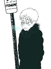
The first thing I did that morning, after writing down what I could remember from the dream, was to draw this:


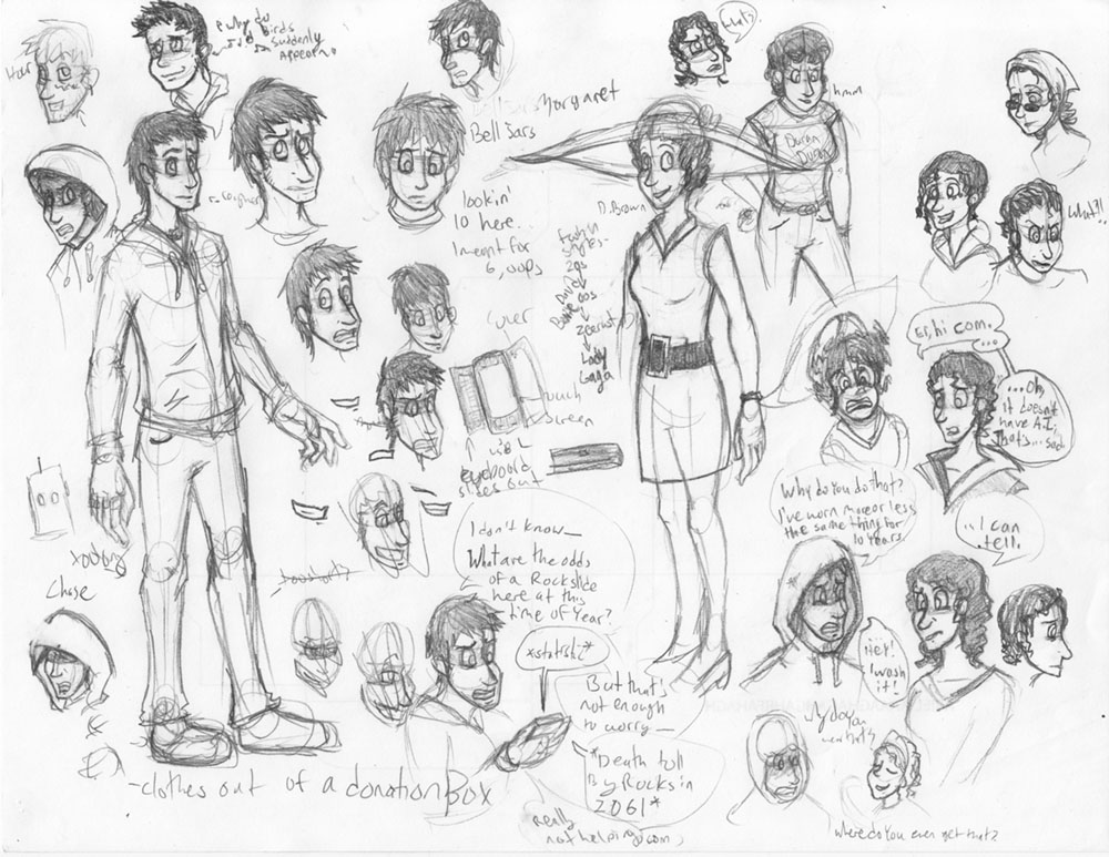
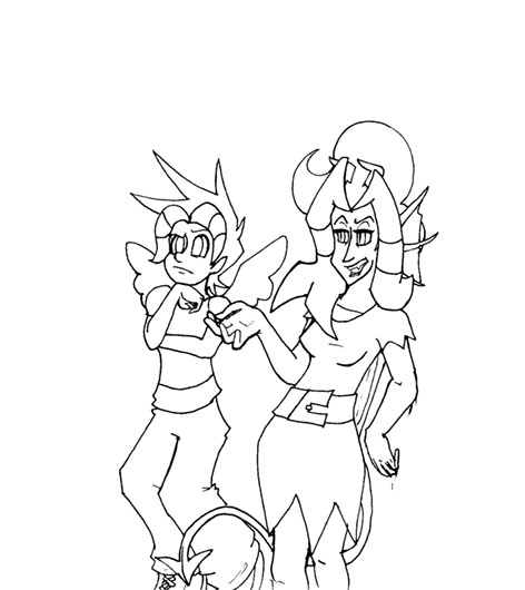
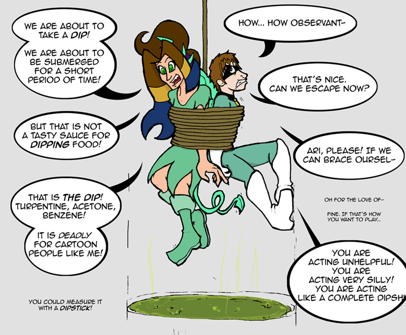
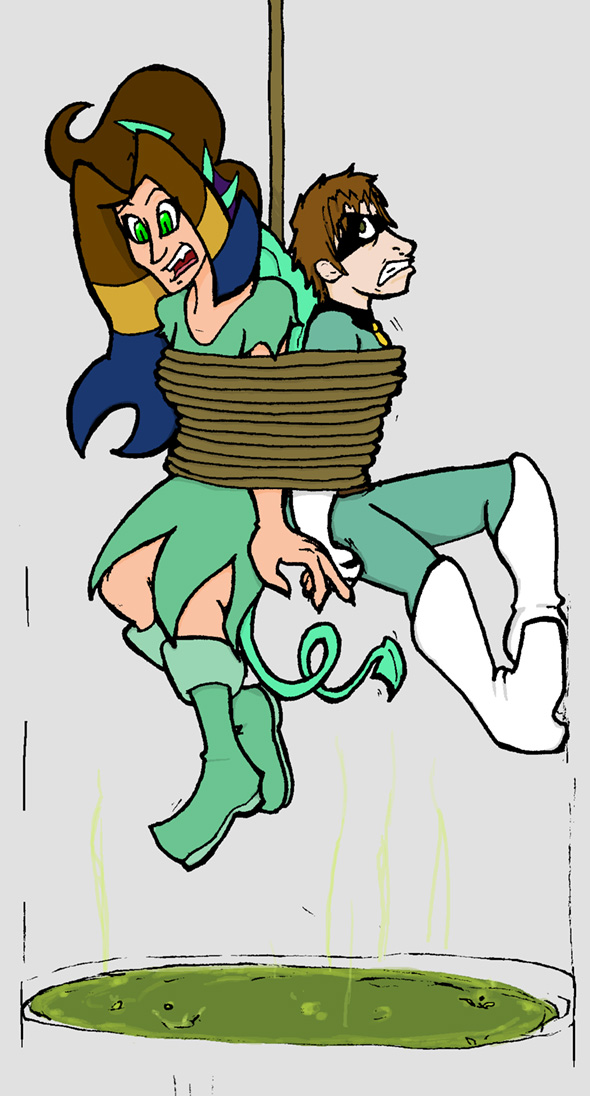
On the left is Chase, the man on the run. I couldn't really remember his name, but I remembered how he looked like. I think I was close to naming him something else (I wrote down a list of names that sounded similar to what I remembered from the dream), but settled on Chase for irony. I think he had a slight accent, but he might have just been putting that on when he talked to people, y'know, for advice and directions. On that note, he can act all cool and confident and classy for about six lines of conversation, but once the other person talks about something other than the city or whatever answers he wanted, he is incredibly lost. Fortunately, he has Margaret.

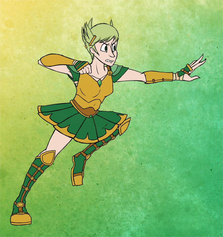
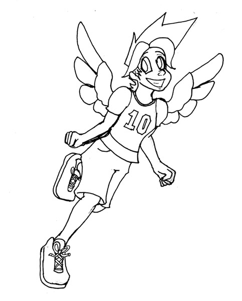
Margaret, the girl on the right, is pretty interesting, too. I could remember her name clearly, most of her appearance, but the best part of her sort of developed as I drew her. Initially, she was in sort of a retro sundress-like thing, but I was sure I pictured her in something more modern or futuristic. I played around with her design a bit until I realized that, hey, why couldn't Margaret change her outfit frequently? She is definitely the kind of person to wear a different fashion every day, even while on the run! So, yeah, I took that idea and ran with that. You can see beside her that I wrote a list of styles she could cycle through. Really, this is also an opportunity for me to stretch and come up with lots of different outfits.

Also! With her changing style, it's kind of important for me to give her some consistent, identifying features. Those would be her curly hair, her face, and her colour scheme, as much as I can help it.

Bonus round: in the middle, you can see Chase talking to a blackberry-like-thing. It doesn't actually have A.I., just a few voice-activated features, but since Margaret is one of about two people Chase has ever extensively interacted with... He gets kind of lonely.

So yeah. I have a ton more on these two, but I already have more writing here than art, so that'll have to wait.

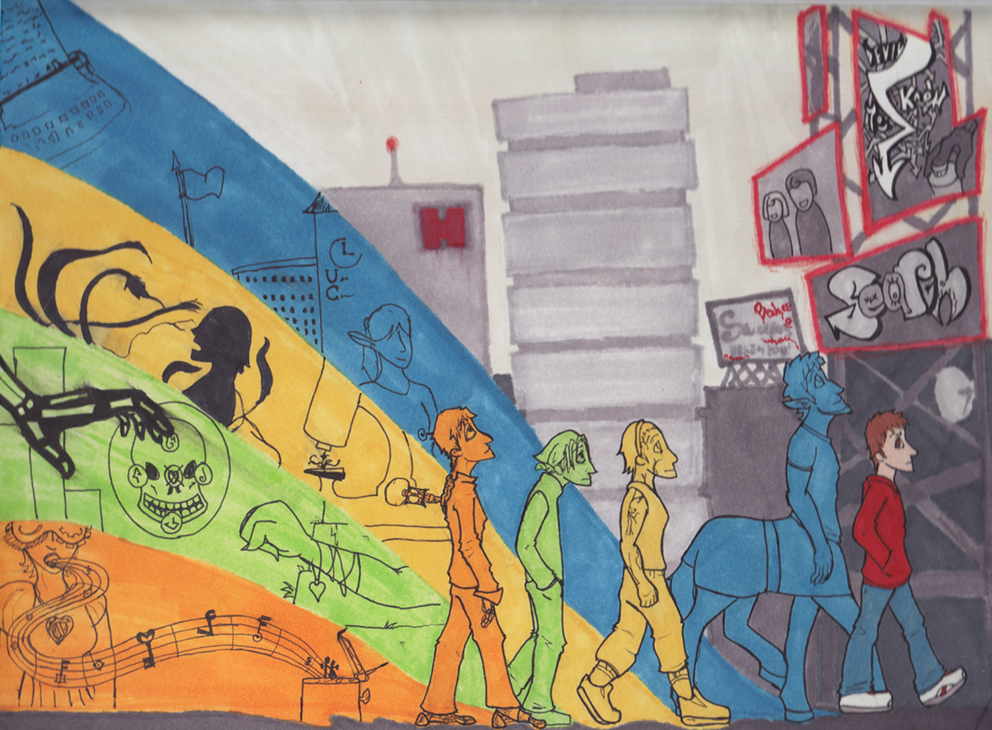
So, have some more sketches:


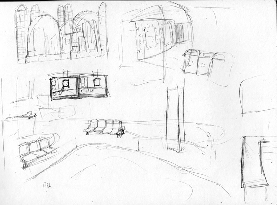
I sketched out a few other scenes I could remember later that week. Top left is what these domed cities look like from the outside, to the right of that was a hall in one of the college buildings, leading to a underground movie theater, as seen from a little service corridor.
Below that is an open ice-rink area in one of the mall-like parts of the city.


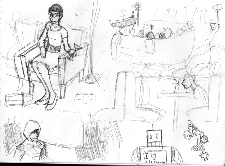
And here is Margaret looking uncomfortable at some kind of school reunion or social gathering. To the right of that, a view from behind of a different party she goes to later that night, or the next day, and drags Chase along to (before she knows who she is and such). Naturally I decided to draw them from behind, sitting at that couch.

Below the couch party is a scene from a restaurant that was also in the dream. I was more worried about the table-layout than the people there.

Bottom left is Chase, caught between two groups of robots.

Speaking of robots, the final two little doodles are some sketches for them. They're supposed to look more goofy than intimidating, since they're usually used for friendly interaction with civilians. And, hey, normally, they're great to be around. They love humans! Even the one with sawblades on his hands. He's usually in landscaping, but a few of them were out so long, they started malfunctioning...

And it looks like I drew a tiny robot beneath them that sort of resembles the GO-4s off WALL•E.

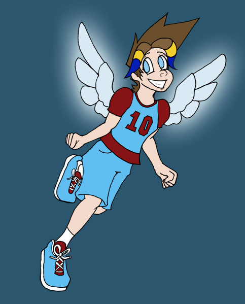
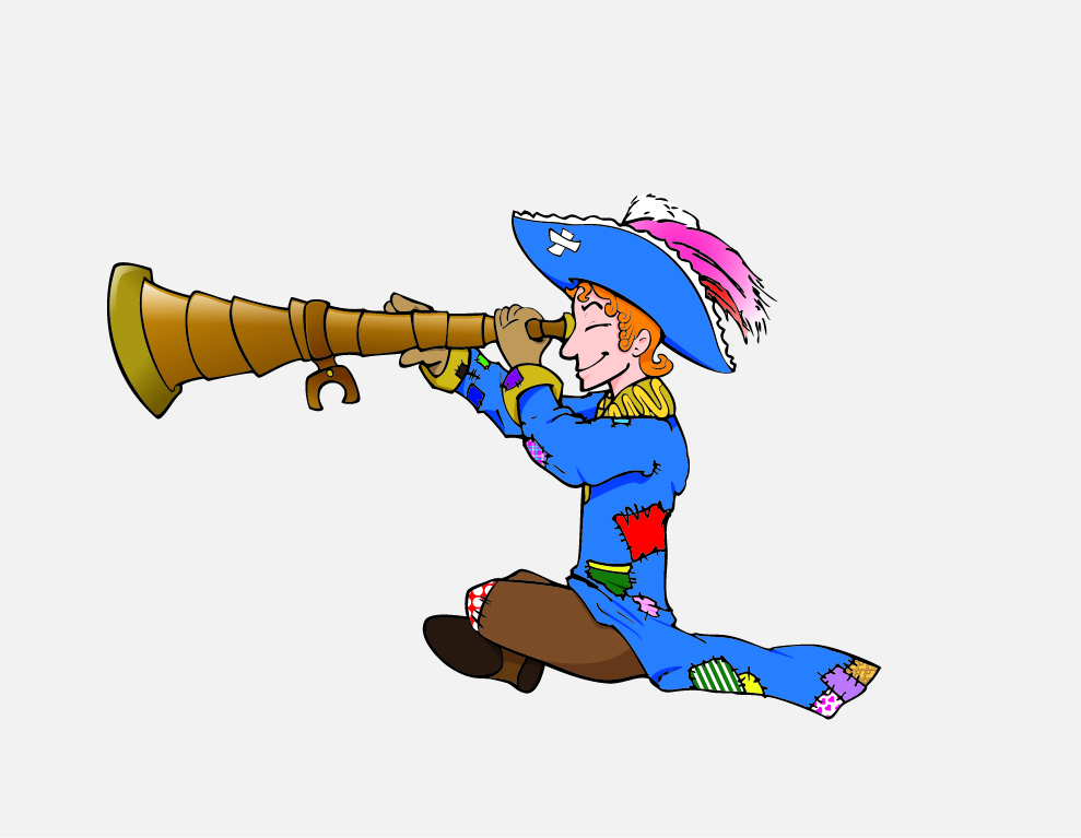
Okay, and one more for the road:


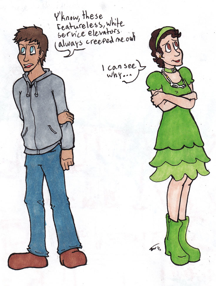
I used to colour everything in marker before I got a fancy Mac and fancy photoshop programs. Sometimes, I miss it.

That's all for now, folks!

Friday, June 4, 2010

Illustration Friday: Slither

I told myself I wouldn't do anything snake-related for this prompt. Slither. It's just too obvious.

Then as the night wore on, my mind kept returning to how reptiles are often bad guys in the cartoons and movies and books I could remember, and then I started getting annoyed about that. Finally, I determined that what my reptilian friends need was better press, and what better way than a cutesy cartoons where they are the heroes for once?

"Okay, gang, so whoever our litterer is, they're shedding. If I'm right, we can follow this trail right to them, but we might have to split up," Colby the Cobra said to his fellow Slither Scouts, and adding, after a moment, "Sorry, Horatio."


So yeah, here we have the 'Slither Scouts'(or Slither Squad, Serpentien Serpentine Scouts, something like this)! A club of a few young snakes out to explore and have fun and solve mysteries when they can).

Colby the Cobra there is the leader, and to the left is Vicky the Viper, contemplating the evidence. The little guy on the right is Greg Garters, who is not yet in the club and so does not have a nifty blue bandana. Hiding behind him is Horatio Hognose.

There's a Python and a Boa in the club also, but I was having trouble deciding exactly what species I would use as their base, and I was running out of time. If your eyes are keen and my hands are talented, then you might see that Colby is an Egyptian Cobra, Vicky is an eyelash viper, and Horatio and Greg's species are like right in their names, but I think Horatio is some manner of Eastern Hognose, while Greg is... the Common Garter, basically. Yeah, I know, some of these guys aren't even in the same hemisphere, but I'm going to play the cartoonish creative liberties card, and say it's more interesting to play with snakes from around the world instead of restricting myself to one country or continent. As well as the typical 'this is a world where snakes talk and solve crime and wear cutesy little bandanas and you have a problem with ' card also.

So yeah, I could rant on for a good 500 words on why snakes are cute with proof, and I could also go on about the personalities and stuff on the Scouts up there, but I am le tired and I need to also work on that 'posting/picture ratio' thing. Maybe when I sketch out these guys some more, I'll make another post.

... And yeah, the background is... not as nice as it could be, but the deadline was ticking closer and the snakes were the focus of the picture.

... Which either came out blurrier than I wanted it to, or I really ought to go to bed. I'm going to say the latter, because there are birds chirping outside.

HI ILLUSTRATION FRIDAY! Man it's been awhile. Next post will explain my lapse in posting, I swears it, right now I need to sleep. Did I mention how tired I am?

Wednesday, May 19, 2010

WIP Wednesday!

Work-in-Progress Wednesday!
(If I make it almost-alliterative, that means it's a feature, right?)

So, yeah, that was embarrassing, saying that I update at least once a week, then... Missing an update. *cough*

On that note, I think I will make this dinosaur thing a little more... infrequent until I can work out a proper schedule. ... I'm new at this, okay?

So, yes, the art post for today, ahem.

I recall something my portfolio class teacher said, about not uploading bad art, something to that effect, and that time my mom told me to stop being so self-depreciating.

Well, today, I get to defy TWO authority figures with one stone! Post! Figure of speech!

And by that I mean this is what I've kind of been working on lately:


The working file is WAY bigger (which is why the glowy effect around her wings is so large *cough*), but yeah, here we go. I intend to make this part of a wallpaper when I'm done, and right now I need to shade this and... fix that eye, but I'll save that for later.

So... Yes, explanation. This is Arianna, a character I made waaaay back when. The shortest (and long-standing) backstory is that she's one of those shoulder-advice angels. Depending on my mood that day, she also might dispense hilariously bad advice.

Normally, though, she's kind of Ari's sidekick, as seen here (incidentally, another work in progress):


"That's the problem with real people, Anna. They're so boring!"


Also I created these two between the ages of ten and twelve, so there's a LOT of history with them. Also explains why they're kind of anime-ish and crazy-haired.

The Max to Ari's Sam, as I said once. Only... Ari's not exactly smooth herself. They're both sort of cartoony bringers of chaos, and are comedic-duo-y with each other. Something like that.

ANYWAY, today's drawing.

My main issue with it at the moment is the fact that Anna's left eye there looks off. At first, it was kind of uneven:


"Whoops, made her hand too thin... *furious scribbles* GOD BLESS PHOTOSHOP."


So, I thought, 'hey, I'll touch it up in photoshop, how hard could that be?'

I've gotten better at gauging my skills in these situations, so usually I'm right. However, I redrew that eye like five times and it's still looking kind of wonky. Of course, I also have been staring at it for a long time, often too close to the screen, so hey, maybe it's not so bad.


Ariel-vision, reduced by 50%


Of course, at the time, I was inwardly a ball of rage and fury at this misbehaving bit of art. I start shading, realize that I'm too tired and frustrated to have it look right, so I call it a night. And before I do, I think of something...

Ariel: Hey, what's that thing some artist do? Right, they flip their work to see how it looks like from a different perspective. Hey, maybe if I do that, what I need to do to fix that eye will be clearer!

Ariel: Hm... No, it still looks kind of wide. *leans back* ... And now, her head looks flat too. ... FFF whatever I'm going to bed.

So, yes, readers. Not every day is one full of great success, but that's why you've got to leave that file open and keep working on it.

... Or something deep and inspiring like that.
WELL! Back to work I go!

Tuesday, May 4, 2010

Dinosaur Day - Stan the Stegosaurus

(These posts would come faster and easier if I wasn't such a research purist. To look more professional, I wanted to avoid wikipedia or any books with 'Extreme' or 'Awesome' in its title. Ah well.)

Stan the Stegosaurus


Stan is an adventurous little guy, which is why he has a pith helmet, and that shirt, and that canteen. He likes exploring the melting pot of time periods that is this cartoon dinosaur universe he lives in with his best friend, Terry the Triceratops.

His favourite type of food is garden salads.

Stegosaurus Armatus

When people usually talk about Stegosaurus, they probably mean this guy.

Stegosaurs were large herbivorous dinosaurs, and roamed around during the late Jurassic. They were about 9 metres long, and supposedly could reach three or some odd tons.

The most interesting feature that I and many grade schoolers doing reports on dinosaurs find are its plates and tails. Speculation on the plate’s uses have ranged from armour, communication, cooling system, or mating signal. Or other display signal. Maybe like those neck-fans and frills some lizards have.

They also have a large canal-type deal on their back - some think there was a second brain there to help with reaction time, while others suspect it is... a gland of some sort, I’m not sure and I don’t want to copy+paste off a website to sound like it.

That spiky tail at the end was probably used for defense, and yeah, I imagine it would hurt quite a bit to get smacked by it. Also, apparently some scientists actually refer to it as a Thagomizer! Score another point for Gary Larson! [/old news]

I will include development sketches for this Stan character at a later date. For now, enjoy his vector image and be amazed. Also thankful that I am not going into extreme detail about how I drew him for a cereal box. I did that enough over here.

Sources

(Will add when I am not halfway out the door. Hello, graduate event!)

I am either terribly rusty at this 'research' thing, or it is too hard to find information that does not look like it came off a site built in '99.

Yup! If all goes well, hopefully I will have another post like this next week. But better.

Musical Drawing: I've Got Some Falling To Do

Nervous posting as the hours tick by for this event? You'd better believe it!

So... Yeah, I also imagine little animations in my head while I listen to music sometimes, and Lemon Demon's "I've Got Some Falling To Do" is one of those songs.

This image therefore is sort of what I see in my head when I hear it.


... Though, honestly, I feel this looks a little crowded. In my mind, during the musical interludes of the song (seriously you guys listen to his music if you don't already) the main character falls through the sky, and passes by some weird trippy stuff chilling on the clouds.

That said, if I had the time I would exploit the infinite canvas that digital drawings can have and make this thing even even longer, so I could space out the oddities better and add some more.

Speaking of, if you've listened to the song, the imagery in the picture is probably a little obvious, but for those who are at work or school or are otherwise without speakers or something, then I will give a short rundown: The plane represents the plane the character falls out of, the grim reaper on the cloud represents the Angel of Death who rings him up, the squid represents the giant squid that catches him, and the lemons raining out of a cloud represents the creator of this song.

And because I don't like how crowded that drawing is, here: have one without stuff.


Yup, and that's all for this post!

Musical Drawing: Cell Block Tango

So in light of this event that I'm going to today, I decided to do some new art to make myself look good!

Then I hit an art block.

As I was fishing for inspiration, I put my music on shuffle and closed my eyes. Cell Block Tango from the Chicago musical started playing, and then I got a great idea.

So, yes, I think I might make this a thing, now, where I listen to a song and draw what's on my mind, ideally something that accompanies, represents, or symbolizes something from the song.


Ta-dah! ... I think it got a little blurry when I saved it last, but, er, there will be a higher-quality version in those little portfolios on my sidebar. Yup!

So yeah, I was inspired also by the movie adaptation of Chicago, since that's the version I have. I didn't draw any of the women in particular, just elements resembling the kinds of outfits I remember off the movie. Though I'm pretty sure none of them had tails, she looked kind of small without it. It... It made sense at the time.

Yup! That's it for now.

Montage Assignment - City of the Lost

So we were given an assignment in another class to do a montage-image based on song lyrics, scripts, a book, or our own creative writing. Guess which subject I picked.


Alright, so I could probably write a novel about each of the little thumbnails here (and in one case I kind of already have!), but I will be short and quick about it:

Top left, Nero and Yuu, those demons from my other post. Below those three, is a layout for a zombie story I was/am writing. Beside the zombies is one for a small sci-fi-ish idea I had involving a guy on the run from police robots. I'll make a post about them later. And finally above that one are some ideas that eventually turned into the one I went with. (If you tilt your head to the left a bit, you'll see it at about the top center of the page)

So I fleshed out that one a little more.


So these are characters from a comic I want to do one day (after I get through Superfailure and more of Carol in the Woods). From left to right, we have Mechael the clockwork robot; Thane, the teen who can slowly kill things by touching them; Sarah, the scientist with some kind of parasitic/symbiotic vine-thing in her veins; Aaron the centaur, and Steve the human. Behind the first four there are little streams that contain bits from their backstory, while Steve doesn't get any.


Tadah, here's the final thing. It's a bit blurry because the board it was mounted on was a little too big for my scanner. Also I was scanning this at not-four-a.m., and therefore kind of... uh...

SO the basic premise is that five people from different worlds wake up in a weird, empty city one day and then try to figure out why they're there. In between epic, mind-screwy breakthroughs, they just hang out.

So yeah, I have colour schemes for these characters picked out, which you can see here. I don't want to go into too much detail because part of me is convinced that this will spoil the plot before it's even finished, but, eh... Well, Mechael's is about his 'sister' and the fact that he's a wind-up-robot, Thane's relates to some traveling party of magic-users he was a part of and a girl he likes, Sarah's is about her 'acquiring' the sybiote, and Aaron's about him being in university because he is basically a normal guy, just with half-a-horse as his legs. Steve doesn't get one partly because he, too, is a normal dude, but also because he's a city-kid, and to adapt to the situation he starts identifying himself with the city. Or something like that. His colour theme is red, make of that what you will. Also!

So yes, other elements in this story is someone who drops cryptic hints via graffiti, two creepy newscasters, the apartment they live in, and the creepy hospital. And monsters called Sweepers, you can see a warning about them on a billboard in the background. Also! I tried to make the city background transition into the backstory-backgrounds, and sort of line up with elements there. It... kind of worked.

Speaking of, I intended for the buildings to be blurry! Since the city is ~mysterious~ and all, you see.

For the sky to be streaky... not so much. To be honest, I had to do a lot of this in a short time, which is a shame. On that note, the ink is supposed to be smudged in Thane's bar there. I did that by accident, realized it went cool, and then went with it.

Like many things I draw, I will go back and make this pretty in photoshop, and unlike many things I draw, I really mean it with this one.

Vector Revisits

I am insane. I know this because I attempted a vector imaging of the pirate I drew way back when. Why would I even do that? (Aside from the fact that it was easier to fix up a few mistakes and that I wanted it to be clean and shiny for a new twitter background)

Oh, right, it looks smooth and sharp when I do that. Carry on, then.


In retrospect I probably should have resized this a little more, because it is either that or my more experienced artist's eye that's making me see a bunch of tiny mistakes (which I won't tell you because that would destroy the illusion of me knowing what I'm doing).

So, yes! I'll go back to working on this when my wrist doesn't feel like its melting or turning into limestone.
(PS. omgomgomg look at the telescope looklooklook it is shiny!)

Monday, May 3, 2010

Final Assignment [3 page comic, Carol in the Woods]

So in a long story I documented on my project blog, for my final project I did three pages of comic. It was about a crazy person dressed vaguely like a Mountie walking through the Canadian wilderness, and I called it 'Carol in the Woods'. You can read the whole thing over here, but for fancy Art-Blog purposes, I'm posting the first page and my personal favourite of the three:


A close second was the last page, because of my playing around with perspective and frame arrangement, but this page I ended up spending more time on. Even if that log on the third frame is a little unfinished. I'm thinking of doing a version of these pages coloured, and a version of these pages just black and white inked. I'll let you know when that's finished.

About the page itself (and I promise I won't write a novel; I already did that in the project blog), I was playing around with the panel flow, sort of, making it look like Carol was walking uninterrupted, while traveling great distances, that sort of thing. I also wanted to show off a variety of scenery, too. And finally, I wanted to hint that she was a little unhinged, through including little things that are 'off' about the scenery, like eyes where they shouldn't be. Er, though the 'story' is more about Carol going places and seeing stuff than any deep analysis of an unstable mind.

Yup, I think that's about it. I've gotta go do some more art and stuff to mass post by tomorrow, cheerio!

Saturday, May 1, 2010

What I REALLY Did Over The Semester (sketchings)

'No Ariel, noooo this is an ART BLOG don't post terrible art here!'

Well... Okay, see, I have a confession to make. Throughout the semester, I carried a binder around with me, with the intent to hold lined paper for notes and also assignment/instruction sheets, that sort of thing, but going through it last week, I noticed that a lot of it really was just pages and pages of little drawings of things ranging from eyeball-practice, to whichever character of mine I had in mind that week, to my reaction to something I'd seen or heard or thought (towards the end of the binder, there are a lot of me looking like a sleepy zombie). I slightly justify it by having notes from a lesson or assignment brief in the side (come to think of it, that's kinda funny, since I've gone from doodling in the sides of a notepage to writing notes in the side of a doodle page).

Now, a disclaimer for my parents and past/present/future instructors: I have a short attention span and I'm very fidgety. Even if there's a lesson going on, and one of the things I found I could steady myself with is occupying my hands with something. At this point we get a choice: Clicking a pen repeatedly, or using that pen to draw. For my sanity and that of others, I generally do the latter. I'm still listening, and heck, I might be listening better with my hands distracted. It... It makes sense to me. IN SHORT: If I'm drawing during your lesson, I'm still there! ... Or I'm trying to keep myself from falling asleep because I had to get up at 5 for your class or something.

ANYWAY enough writing, because my teacher commented on that last week, here is a few pages out of my improvised sketchbook:


So, here are a few characters I find myself drawing when I can't come up with anything else to draw. The spikey-haired fellow calls himself Nero, he's a demon; the man with the feathers is Yuu. The kid down at the bottom is called Kri, he's sort of an artificial demon. It's a long story.

This page was mostly an attempt for me to practice action shots. I think I have poses well enough, I just need to practice motion and flow... My hands are getting better, though! Also bonus fun of drawing reaction faces/bodies. Like how Yuu's feathers ruffle, or Nero's wings go squiggly.


You see, in this story, Demons and Angels refer more to beings that live on a different plane than anything religious. Yuu was framed for something really bad, so he was exiled from his plane. He kind of blames Nero for this, but hilarious circumstances force the two to work together! What an odd couple!

In this edition, I sketch up how Yuu looked like while he was still in inter-dimensional law-enforcement (yes his hair is supposed to look hilariously bad), and basically use this as an excuse to draw his wings some more. Bonus round for Nero showing some demon features he'd rather not let people see.

I could show you one more page but that might require more explaining and I think I'm running long already, so I'll leave you with something I coloured kinda quickly, as practice in photoshop/a way to ease my nerves with the upcoming thing on Tuesday.


Bonus note about Nero: his wings are made of shadows, partly because it's cool, and partly because I liked drawing thin, papery wings. Also gives a contrast between Yuu's big, beautiful, powerful, and sometimes more detailed wings, and his tiny, simplistic, thin wins. I'm going to try to contrast those two a lot, see, it's part of their dynamic.

And yeah! That's all for today, tune in tomorrow when I post a certain little dinosaur again...

Friday, April 23, 2010

Assignment: Promotional Postcard

Man I am SO happy with this concept, especially when it took me forever to get to it.

You see, dear readers, we were supposed to come up with a card to promote ourselves. A postcard.

My problem was that anything that featured my regular characters had some dialogue and that got cluttered, anything with me personally was a little self depreciating, and any combination of the two was a clunky disasters. There was also some things trying to advertise me as some kind of character-creating machine but I really wasn't happy with the look and feel of those too.

Defeated, I turned to my doodle page and started brainstorming again. Back to the drawing board, you might say. I then told myself that I'd try to come up with something using the next thing I sketched, with the theme of 'AWESOME', since I could advertise some percieved trait of myself or something.

I started drawing... A cowboy. Riding a unicorn. No! Riding a... A ROCKET UNICORN! ROBOCORN!

But what would be awesome enough for them to f- T.REX!

And thus, this drawing. From there, I just let go and got as reasonably ridiculous as I could, escalating my idea of 'awesome' within the drawing - make the T.Rex breathe fire, make the exhaust magic - at one point, one of my sketches of the T.Rex had a wonky right arm; I got frustrated and gave it a hook. Just about everyone I showed it too afterwards demanded that I keep it in, so I did. Pretty cool, huh?

Oh, wait! The art, that's right!


Dinosaur-wrangling got a lot harder when they taught themselves to breathe fire...


At some point, there was going to be a field of, like, Triceratops or Stegosaurs in the fields behind them, but, er, it was... looking cluttered, yeah. I'll try to make it work, though, but... perhaps not when I have a deadline.

Details! The lasso is coming out of a spool-like-thing on the Unicorn's saddle-part - which is actually its middle, since it's a robot, it's built right in. The T.Rex's lines are a little thicker... but its eye is shiny? Also check out those clouds!

So, yeah, I also have to say that I might have been partially inspired by the likes of Dr. McNinja and Axe Cop. And this game from Cartoon Network that I can't link to you right now, but I'll edit it in later. And here we are!

(PS, you should totally read those comics I linked, seriously they are awesome. One is about a ninja who is also a doctor, the other is drawn by a 29-year-old artist, and written by his 5-year-old brother. That is all you need to know.)

OH, in terms of advertising myself also, after using the front to generate confusion and curiosity (confuriosity?), the reader will check the back and see text along the lines of 'You, too, may have this much awesome in your employ!' or 'You, too, can have this much awesome at your commmand!' something like that to advertise myself and my crazy brain. Sounds good, right?

-dusts hands, looks at posts- Huh, nice, all that work and it's not even noon! Good work, me!

PPS, kids, this is what happens when you try uploading a CMYK file to the internets:
NOOOO MY COLOURS

Groovy.

[Illustration Friday] Round 12: Linked

Alright, I'm nearing the end of this postingpalooza (unless I find more neat stuff to show you before time runs out), So here's another hand-drawn thing showing off something we all probably have experienced before:


There's always ONE.


Ah, HTML. I could be happily coding a table or a post, but miss ONE LETTER and the whole thing goes to heck. Incredibly frustrating, especially if it's like, a lengthy bit of story you wrote in a comment and now it is uneditable because you posted it but the code is wrong and you can see where you made the mistake and it's right there but you can't fix it--

Right, right, so, I liken this to those Christmas lights, y'know, where one bulb would go bad and then the rest of them don't work? I've never seen that personally (probably because mom and dad are like ninjas when it comes to getting out decorations; I could be in my room for an hour and then I'll leave and find the Christmas tree assembled and ready), but I have a feeling that searching through coils and coils of lights is like searching through lines and lines of text when it comes to this sort of thing. Assuming you only made one mistake, too.

Pen and ink again, with marker as the outgoing link in my hands there. I think my hand slipped on the jaw, but I kind of like it like that. Glasses are small so the eyes aren't completely blocked out by the frames, I hate it when that happens, and that's the only reason I still occasionally 'forget' to draw my glasses. God, my drama teacher was right about that, I never thought I'd agree...

Next post is going to be AWESOME.

[Illustration Friday] Round 10: Rescue

HERE WE GO AGAIN WOOOOO--

-checks drawing for this prompt-

--ooo, right.

I was a little... Melancholy, shall we say, when this prompt ran, and most of my concepts ended up here:


How can you tell if someone needs rescuing?


Well something like that, to the effect of not all damsels and dudes in distress really show it. Because I was feeling really self-pitying that weekend (as usual, I put the blame solely on sleep deprivation, and nothing else *nod*).
I'm not sure if it came out quite as clearly here, though. That's supposed to be, like, that writing you do when you breathe on a window? Like that, so it's hidden unless you know where to look/breathe.

I did this entirely in pencil, with the words done by etching them in with a dead pen (and now the page beneath it has cool secret writing too!), and then going over it lightly in pencil, and then blurring that pencil with an eraser. Done and done.

I probably should have darkened the space behind the dude, though, but eh, next time.

I seem to swing between childish-ridiculous and whiny-depressed. Curious!

[Illustration Friday] Round 7: Brave (missed)

SO YEAH I really actually like this one and I wished I finished on time (partially because I had that texture technique fresh on my mind at the time, and now I forgot it).

For this one, I thought about brave things. Knights are brave. Lions are used to represent bravery. When you're little, you try to be brave and sometimes wanted to be a knight... Well okay maybe that's just me (and my steed was totally a dragon, not some silly little lion), but still!

With the childish thing in mind (and because I like doing simplistic drawings sometimes - feels like taking a break, y'know), I went forward with this! ... Several weeks after it was due!

... I should probably stop going on about doing things late. >__> Well, I mean, I had like five other things to do at the time but--

RIGHT. CUTE ART.


So I did this little number up in Illustrator, but I forgot how to properly, like, put textures on individual pieces because I'm a pro. I will bet you actual money that I remember how when I get home tonight (in which case I'll redo this and add it to the pile of 'remixed art' I'll release some time). I should probably not talk about me forgetting things too.

Ahem, right, I still wanted to throw down the papery texture, though, so it felt like a children's drawing or something out of a kid's storybook. ... In this case, a well-worn storybook. Because... it's real popular, yeah, that's right...

Honestly, there was a period there where I was afraid I was going to really hat that knight when I was done with him but he turned out surprisingly well! I did some neat little multiply-transparency-gradient to make the armour shiny, and gradients for the little visor-slots and the shading on his feather.

The lion, I had a decorative brush, I think? I had one of those outline a circle, that's how I got the mane down. It worked better than I had hoped!

So yeah I really like this. PS, here's a version without the texture so you can see it in its original eyeblinding glory:


Yup! That's all for this post.

... Y'know, I should draw cutesy things in Illustrator more often...

[Illustration Friday] Round 4: Adrift (missed)

So, yes, this is one of my old Illustration Fridays that I missed and thought 'oh well, I'll finish it later and it'll look awesome'. Yes, well, apparently, I need these Illustration Friday submissions for, like, marks. WHOOPS.

SO, here is Adrift:


Oh no! A rare sky-jelly has been knocked astray from his cluster! Poor little guy!


*ahem* There's a bit of an embarrassing story behind this, as I was all set to use a nighttime city background to make it look like he's drifting high above the earth, but not having any on hand, I hit flickr. I realized that this was one of those things I'd need permission form, but I am way too shy, so I asked 'is it okay to just use this if I link back?'

It was one of those moments where you realize you're saying something really, really stupid the moment you open your mouth, and you can't stop yourself - you can only listen to yourself ask that dumb question in glorious slow motion. I'd like to say I was tired or desperate or something at the time, but ehn, no excuse. God, I felt dumb that day.

Yeah, no, you can't just use stuff and credit without asking. This isn't DeviantArt, after all.

SO YES, don't worry, with all the extra time I got after missing the Illustration Friday deadline, I had time to scrounge through some old pictures of ours and found a blurry .JPG of Toronto at night that we took from a hotel one of the years we were at Anime North. Good times!

Actually, with a little tweaking, it worked. It kind of looks like a city street or something, right? I mean, technically it is, but it looks like it's from real high up right?

... Yup, and thus begins post one of the post-a-thon today. (Why yes, today is my last day of class, how could you tell?)

Friday, April 9, 2010

Illustration Friday [Round 11: Dip]

As usual, after sitting and ho-humming (I think that's a verb now) over some design or another representing my deep insecurities, two ideas collided in my mind as I tried to figure out a better interpretation of the 'dip' prompt on Illustration Friday. Then I started going through definitions, and somehow, these all connected in my mind:

1) The Super Dictionary, from DC comics. I wish I could tell you more, I wish I even knew where to start linking, but the best I can do is link you to a Google image search like a pro and pretend I accomplished something.
For the link-phobic, essentially it is a dictionary for children with definitions illustrated through various DC superheroes. Needless to say, er, more than a few of these definitions seemed a little oddly placed, scenario-wise, or downright confusing, but overall, hilarious (Forty cakes, anybody?).

2) The Dip, from Who Framed Roger Rabbit. You know the one. Paint-thinner, designed to kill your favourite cartoon characters.

... Okay a little melodramatic, but you get the idea. But how could I use the dip for illustration Friday?

This somehow ended up with idea three. Remember that bit of original art I posted a few weeks ago?

Well, she's technically a superhero... and in her story which I haven't elaborated on before this moment includes something like a cartoon character come to life, so...


Well that certainly illustrates the diversity of the word


And... yes. I am awesome and apparently picked a colour theme for my characters that does not translate well to the web at all! Woe is I. I... Will fix this somehow later. In the meantime!

Yes, the one on the left is supposed to look like a ridiculous anime-character. See, in-story, she is... Well, she's a thing that based her form on someone's childhood imaginary friend. The girl on the right, actually. Also known as the Animator. She controls ink. Together, they fight crime! Kind of. Fascinating story, really.

And yeah this is typically how they interact on-screen, at least in non-plot-significant situations; with Ari the anime-thing making hilarious off-the-wall comments and pop-culture references, and Annie over there trying to hang lampshades and criticize the typical stunts and situations of the superhero genre. Genius!

Though I will admit, I usually don't go as overboard with Ari's hair. I was just having so much fun drawing this though, I didn't want to fix it. Honestly!

... Though something's bugging me about the word balloons, but I guess I'll just have to agonize over that until I am awake enough to make good decisions again.

So, yes, because the dialogue looks a little cluttery to me after staring at this project for a few hours, here is a smaller version sans text:


Tadah!

Which reminds me, I swapped out my header for one with Ari in it, since she's in this week's IF post and all, but I'll switch back to the dragon-guy, or maybe someone else. See, I originally intended to have a rotating header bar, but, uh, ehe, I only had one header to use at the time. Now I have two!

And yes, I'm sure you'd love to read more of my lovely and eloquent writing, but I am very tired right now so I am going to bed. Thank you for reading and stuff, the usual!

Thursday, April 1, 2010

Assignment [Ride for Cancer Research Postcard]

Yup! The idea here was to draw something nice and post-card-sized to hand out to people for donating to the Ride for Cancer event, and make it something that someone would want to post up.

For about a week I was waffling on using some terrifying huge-eyed cutesy character congratulating someone for making a donation, but then as I was reading something with my brother, we somehow got to talking about this achewood strip, and I was struck by a brilliant new idea.

At least I think it was the achewood strip. I'm not sure now, but if I were to put money down, I'd say that's where it came from.

ANYWAY

The idea behind this postcard is a bicyclist making a ridiculous jump across a huge canyon, an 'awesome' move, much like the recipient of this card donating money to a good cause.


I drew this entirely digitally, so no rough sketches, though I did muck around with the text placement. Originally, it was on the lower end of the card, but after leaving it for a few hours, I reopened the file and realized that the text was covering up and filling up the nice little canyon I drew, and decided that the sky was less important than the depth of the canyon. Soooo I moved the text.

The original:


And because I like it so much, the card without the text:


I think the canyon's edge might be a little sharp in places still, but I was having a heck of a time trying to get those corners blunt and still looking good. Eeehn. I kind of still like it like this, though, so there.

Assignment 2 [Storyboard: Trace]

... Yup. We'll just... pretend... this happened a month ago.


My younger brother was the model for this shoot, though I took some liberties with his hair (it's brown now), height (a little taller), and clothing (wearing a coat; not in track pants, clothing colours). I wish I didn't have to make him take off his awesome glasses, but alas.

So that's enough embarrassing my brother on the internet. I kind of blanked out on the background. But... For practice (not for anything I'd ever post seriously, though), I should trace some photos of mine sometime - just doing this helped me figure out the clothing fold thing a little better. And also the legs I've been sketching have been looking a little out of whack lately...

But enough trying to distract from this!

Friday, March 26, 2010

Original Stuff

As I vaguely said in my post yesterday, I AM going to post something today, be it schoolwork or not-schoolwork. As it happens, it is the latter. *cough*

Well, okay, technically, this was still for school, but this is a character I created on my own and sketched prior to the project she featured in. The project in question was a laptop skin, and this was the main image, with a bunch of panels showing scenes from her story as the background. Maybe I'll post the whole image someday! But this was my favourite part off it:


The short story behind this character is that I asked myself what I'd look like as a superhero. Then I got bored in class and drew her a lot and then came up with a plot and personality and so on, and now she's an original character in a Superhero story I'm totally going to write sometime. PS, her name is Annie Matterson. Her hero name is Animator. She did not pick her hero name.

... Of course, part of me thinks it might be bad form to start off original-character posting with a blatant self-insert, but I was having trouble picking which characters and sketches to start with, and this at least looked finished, so I'm starting with her.

... And, self-critique time:
Art-wise, the shading is very basic and could probably stand to be more detailed. Also the pen's shading/highlights look kind of weird. And her right leg looks a little odd going into that boot. I'm not so sure about her arms, either... I don't know, what do you guys think?

[Illustration Friday] Round 9: Expired

Yes I know it's a little sketch, but darnit, I'm going to submit something for Illustration Friday this week!


Originally I had a page of comic planned out and half finished for this prompt, but, er, then, you know, other projects came up, the usual. But, determined to submit something, I sketched out what was basically the main punchline - this guy, the main subject of the page - and that tag. ... It was pretty much the first thing I thought of when I saw 'expire'. Well, that and some convoluted way of connecting it to the patchwork pirate since I wanted to draw him again...

I went with this partially because the concept was clearer here (Pirate was going to uncover some ancient treasure with an expiry date, so), and also because I like zombies. ... Yup! Not much else to add!

And for those of you tuning in from class, especially if you are marking me, I will have not one, but TWO postcards tomorrow (or Saturday, because let's face it, it's me), and then... MORE!

Yup! I mean, aside from the catching-up things, I have been itching to post some non-school related art, and hopefully I will get to do so this weekend! So mark my words, there will be a post every day this weekend! Or at least tomorrow and Saturday.

See you then!